Mark Heaps is the Executive Director for Heaps LLC digital communications studio in Austin, Texas. He’s also a founder of the Click Presentation Design Conference that runs as part of Creative Pro Week. We were lucky enough to meet Mark at the inaugural Click event in 2018 and knew that our blog readers would be blown away by his photography, Photoshop, and presentation expertise. So, I sat down to talk with Mark about his career, the power of visuals, and building a presentation design community.
Hey Mark! Let’s start from the beginning. Could you give us an overview of the path you’ve taken to the place you are in in your career right now?
Way back, I was an American kid living in the North West of England. I went to school for Art and Design in Cumbria and lived in the Lake District which is where my family are from. That whole region has a culture of storytelling: going to the pub and gathering around and everyone sharing. It was definitely very different to how it was being a kid in America.
I ended up leaving the UK after I got done with college and I travelled across the US for years: I lived around the New Orleans area and then around Houston and eventually I ended up in Silicon Valley. The whole reason I moved – and I’m going to age myself here – was that I was looking for work and my brother who lived in Silicon Valley at the time said, “I have some customers who say there’s this new thing called the Internet, and it’s gonna be big. You should probably come out here. I think they’ll need people like you!”
So, I went out there and I worked at Apple and Google, always working in design and around agencies. I eventually left Google to work at Duarte. Nancy Duarte – like Garr Reynolds and Guy Kawasaki and so many of those other people – spearheaded a lot of what we consider presentation design theory today. So, I ended up working there for 7, nearly 8, years.
Is that where you started to really tell stories with your graphic design?
I was definitely from a more traditional graphic design background, and forever have done photography for people. The agency we have now in Austin actually also has a photography and video studio, so I’ve always been on the technical side of things.
At that time, storytelling was still a relatively new idea in the presentation world. It was still about pushing facts and data points. Going in and hearing Nancy and so many others talk about how you could incorporate story into presentations had me sitting there going “Oh my gosh! I could incorporate photography. I could incorporate video.” I could use so many things I know how to do.
For me, that was really interesting. I remember one of my first assignments for Duarte where I decided to do the whole thing as if it was a comic book. We actually did photoshoots to capture every frame and used that for the presentation, which was really cool.
So, you essentially applied your existing expertise to this new storytelling approach.
For me, photography was a skill I already had, and it was something I could dive into. Some of my friends were deep into infographics and data visualisation. Certainly, I had a little bit of that coming from graphic design, but as people started to want less charts and more story, I kind of sat back there with a camera going, “I’m ready!”
Do you think there’s something inherent about photography that enables it to be a great medium for telling stories?
The old adage is a picture speaks a thousand words, and you know people are always trying to cram as much as they can on a slide. I often tell clients when they have too much on a slide, this is a good chance to use a photo.
We’ve also seen this shift with lifestyle photography on stock image sites. They have become so insanely popular because the old cheesy stock photography didn’t feel like storytelling. It felt posed and faked, a bit synthetic. I think people really yearned for authenticity and it’s something they can relate to with storytelling. Where presentations have gone has really been an evolution of that.
That idea of authenticity in photography definitely rings true for me. What advice do you give people for picking authentic images for presentations?
Actually, this is something I do in both sides of my world. In photography workshops I try to explain to people when they’re setting up shots that they need to think about the end audience. If you are trying to get a client or art director to buy the shot, you need to consider how much you’re staging this and how much it looks, or feels, staged.
Then in the presentation world, like Nancy [Duarte] has done in her book and many others have mentioned in the past, I often run through a list of the most clichéd images that are out there. And it’s funny, you’d think that topic as a bit in a workshop would get old, but it lands every time! Every time I show a picture of a dart in the centre of a dartboard, or someone passing a baton at a race, or the multi-ethnic hands all doing a circular handshake, the whole room groans. It’s like, “Oh, you guys have been to one of those meetings.” So, that’s an easy one to build on.
We’re always trying to steer clear of terrible stock photography! How do you wade through the mess of bad images to get those gems?
I just wrote a blog post for Kelby about how we use bubble maps and the idea of getting away from your first thought; how you get to that third or fourth level of the concept. I really love Joe Buchwald from Adobe, who does Adobe Max and all these huge, huge events. I remember being in meetings with him and him describing his internal clients saying, “I think it’s really important that we show everybody’s busy.”
The first thought might be trying to find the most authentic looking photo you can of people in a meeting being busy. That’s sort of on the surface. The second tier might be thinking about what busy means. Maybe it means traffic. Ok, you’re going to have a shot of traffic, and that’s going to be an illustration of the concept.
But Joe is going further from that. He’s saying I want to get as far away from that first thought as possible. I just want colours that are busy. I want busy patterns. In fact, I don’t want people in the shot at all! I just want a motif in the deck that goes from simple patterns to really busy complex patterns, and that will set the cadence. For me, whenever I’m looking for photos, the way I sift through it is about having that extra level of concept.
The other thing is: people are terrible about keywords. Photographers are bad about them too. I’ve been searching for stock photos for nearly 20 years and have figured out how to put in certain words in ways that help to get there faster. Everybody learns those tricks when you do it a lot: that word is too specific, that word is too generic…
Ask yourself “What do I think this photographer would have described this as?” rather than “What am I looking for?” Photographers aren’t presentation designers – even though I would say a majority of stock photos do end up in presentations! They don’t think or speak in our world. So, you have to ask yourself what that photographer would say to illustrate the point you’re looking for, and it might not be what you would say.
That point about getting into someone else’s head and taking another perspective is really interesting. You have a foot in both these worlds, and I am sure they sometimes collide: for example, taking photographs for a specific presentation project. As high-quality cameras are more and more available to people, even on their smart phones, do you think that going out and creating your own imagery is an option?
Not only is it an option, I think they should! We just did a project for one of our clients, a big tech and hardware company. As a part of this presentation they were demonstrating how to speak to an account about a particular product. We suggested that instead of case studies, we should use videos of their team actually doing it.
Immediately the stakeholder was like “Oh hold on, what’s the budget going to be? I don’t know if we’re going to have time to schedule a shoot and bring in the lights and…” And I said, “That’s fine.” We all want a really great looking presentation, but authenticity can be there without fancy equipment, and now we all have a phone that can film very high quality. So, we actually grabbed three of their sales guys and did a test that afternoon. Knowing photography, obviously I was scouting the room, looking for light coming through a window, and picking the right spot, but we filmed it with a phone, put it in the presentation, and they were all stoked! They said, “We just never would have thought about that.”
The phone opens up whole other creative areas, too. I use Adobe Capture a lot for presentations. I was working with a CEO and he jokingly said, “I always love when presentations are artsy, you know? Like, you’re not using a normal font, you’re not doing the normal thing. It looks like someone put some heart and soul into it.” I got a piece of paper and a marker and asked him to write the phrase for each segue slide out. They were quite short title breaks. He did that and I grabbed my phone and used Adobe Capture to shoot it, which immediately put it into libraries for Illustrator, so we could colorize it and bring it over to PowerPoint. It was a really quick thing, but he loved it. It wasn’t just that it had been ‘artsied up’. He was bragging to people for the next week that it was his handwriting in the presentation and he thought that was super cool.
So, I think the phone can get people to do a lot more with presentations. I’m not a big fan yet of presenting on a phone or designing presentations for a phone, which is a new, growing thing. But as a tool for creation, especially for people that are nervous about making visual experiences and presentations, the phone can open up a lot for them.
Opening people’s minds to what’s possible is part of what you do in your day-to-day, but also at conferences and industry events that you are heavily involved in. How did your involvement in that circuit come about?
I started working at events and trade shows when I was about 19, so I’ve always been around them and have a comfort level with that sort of experience. As I started coming up in my career, I realised that to be competitive I had to keep up with all the technology and happenings in the industry.
I wasn’t one of those people who could go to AIGA meetings all the time. Everyone had their mini-unions they would go to and that wasn’t something I could really do. But I could afford to go to two or three conferences a year, I would go to a photography conference, design conference, and business conference each year. And so, every year I got to see those three genres and how they differed.
In maybe my third year of going to those particular conferences I made a decision and said “I want to do that. In the presentation world, there aren’t a lot of conferences that talk to the people making presentations. There’s a lot about how to be a good speaker or performer; you’ll hear people saying to go learn improv. And I’m sitting in the back thinking about what happens to your shade of blue at 40ft, 80ft and 300ft back.
So, it started as “I think I have something worth sharing” and turned into “I actually really want to help.” I realised looking back at my career, I wouldn’t have gotten to be where I was at had people not helped me. I don’t think I got here because I am good, I got here because I was enabled, and that’s a really big difference.
I remember after meeting Richard from BrightCarbon in New Orleans, I thought, “Well, that’s what I want to be when I grow up!” He’s so good, great information, great content, great performer: he’s the full package and I was absolutely floored watching him teach. That’s the important part of doing these events. It gives you a chance to reflect, to look at a standard or quality that maybe you hadn’t considered when you’re in the trenches all the time. And then you say, “Now what do I do with that?” A good way to practise is to contribute back to your community. They say the best way to learn is to teach: for me that really became the epicentre of it.
I was really lucky that people pushed me and helped me up and this is my way of giving back now.
The technologies and formats used in presentations are pretty similar to what they were 20 years ago, and people broadly agree on what’s wrong with most slides. It doesn’t seem to me that new products are truly transforming things. Sharing our skills is the way to make progress.
I agree absolutely. About 20 years ago I saw Russell Brown (Senior Creative Director at Adobe Systems Inc.) speak. He said, “I want to teach you guys the history of Photoshop.” Immediately my brain went to a timeline, with little dots on the timeline, and flags floating above it: I really expected a classic history lesson presentation.
But what he did was push an old overhead projector out onto the stage, pour sand onto it and use his hands to draw pictures in the sand. And I thought, what a cool way of presenting information! He put a little bit of performance into it. And he went with older technology. At the time, he had an HD projector available to him and he worked for Adobe! He had all the technology in the world available to him and he decided to do something analogue. That’s the earliest memory I have of someone saying, “I don’t care about the technology, I care about what will be impactful”.
To me, that’s what I’m always trying to push clients to do. You know from doing it yourself, it can be really hard to get clients to try anything out of the box. It can be a fight to get people to not use bullet points! But when you have that win, it’s really fun.
It is so gratifying when you can open someone’s eyes to a new way of doing things, and teaching is definitely a great way of doing that. You recently authored an online course on Photoshop for Business, how did that come about?
This comes back to the idea of community. Photoshop has been one of my core focuses for as long as I can remember. I started using Photoshop right before they added layers, so about 25 years ago. I get approached by sites to do courses with them and it’s always a lot of the same thing. How many more times can we teach people how to mask a photo? How many more times can you teach people how to make it black and white, or a duotone effect?
So, when Kelbyone approached me, I came up with this concept of production advocacy. It actually stems a lot from presentation design and working in teams. You know how frustrating it is when someone hands you a file and it wasn’t built the right way. Templates and systematic approaches are a core for anybody who works on presentations at an agency or as part of an internal creative group. I brought that mentality over to Photoshop and said, what would production advocacy mean here?
Then I put out a survey online where I asked photographers, graphic designers and retouchers: “What do you wish you could be better at?” And they said: “We all suck at business.” They have these amazing technical skills but don’t know how to sell themselves, or what terminology to use when dealing with clients to write a contract. So, the second half of the course was all about that. It all comes back to this idea of asking the community what it wants and seeing if I can go out and make that happen.
That idea of bringing together your different worlds – photography, design, and business – must be a crucial part of your day to day business now, as well. How has moving from a larger company to running your own business changed your perspective on these different worlds?
It’s a big shift, that’s for sure. Doing this for so long and being exposed to a lot has prepared me for this point. I made a lot of mistakes freelancing in the early days and that taught me a lot. The biggest change is in what I consider as important.
When you’re a designer, you tend to want to make something that’s portfolio-worthy. You’ll fight the good fight for why we shouldn’t use that colour or why that’s a terrible idea for that design. And I used to be that creative! I would literally argue with clients about something, saying you can’t do it, and I don’t care if that’s what your template is, we’re going to do this and here’s why it matters.
I don’t care less about the visuals today, but I’m talking to clients so much more about the problem they’re trying to solve. I think if I could go back to 20 years ago me, I’d say, “Hey, they don’t actually care that much about the ‘art’ of what you’re trying to produce.” I’m more focused now on solving people’s problems in the best way I know how. That comes back to really thinking about the end user and audience.
The other part is, when it’s your place, you are the one paying the bills! Before, nothing mattered more than making a great quality visual experience. If that meant staying up all night and blowing out a project’s budget, you did it. Now, I’m paying the budget. I might really love an idea but try to find something we can do with it that’s a little more affordable. I often ask the team “What’s the scale at which we can do the best we can do?”
And I don’t hide this from the team. A lot of agencies do, and I wish they wouldn’t. They don’t tell their designers what the budget is, because they’re worried it will stifle their creativity or they’ll just give up and say “We’ve only got X dollars? Oh, just throw a couple bullet points on there and buy a couple photos.” I just don’t think that’s true. Limitation is an opportunity to good creatives, and it makes them want to see what they can do with it. I’m really transparent with our teams and I tell them, “This isn’t a six-figure presentation. It’s going to be 10 minutes long, happen once, and you’ve got $15,000 budget. What can we do?” I try to keep a level of excitement about the challenge.
My perspective changed a lot from when I was just making the presentation, to thinking about the relationship with the client. That’s what’s allowed us to be somewhat successful. You can’t be a guy covered in tattoos with long hippy hair, walking in to talk to a CEO of a billion-dollar corporation and not say, “I’m going to care about you more than you can imagine.” If that voice doesn’t transcend, you’re not going to succeed in this field. They won’t care that you know that Pantone book back and forth and you can name 400 fonts. A big part of the shift now is really thinking about the client and their audience more than anything.
We’re in the presentation industry which is a little corner of the design industry. Carving out a niche within an already niche industry can be a challenge. How have found your own niche and how do you act on it?
Finding your voice is about asking yourself what you’re good at. There’s a great book out there called Strengthsfinder which has an analogy that I love. It says that if you got a report card in today’s society, and you got a D in one area, you would become obsessed and consumed with that low grade. You’d do everything you can to make that better. The idea of Strengthsfinder is that if that one thing is not what you’re good at, go figure out how to be the best at all those other things you can do well.
In the presentation world, our studio is really good at systems, toolkits, and bringing an abstract to the idea of presentations. We have two models. One is our manufacturing model: a client will come with all the types of presentation they typically give, and we’ll build a communication toolkit for them. There is a very tactical and systematic approach to this work. A lot of time we don’t make the final presentation, just give people the tools to make their own. You have to think like a User Experience designer.
On the other side, we have clients like E & J Gallo – a wine and spirit corporation – who come to us with huge sales presentations with 30 charts and 100 bullets. They want us to make it better. In those cases, we immediately go down the road of asking them to tell us about a particular wine, getting into this story of it. And we know that we can execute that well.
Where I see people fail is when they come out of the gate and have read a book by Garr Reynolds or Nancy Duarte or Seth Godin and they think that they need to handwrite post-it notes and stick them on a slide, and it’ll be perfect. No. Nancy can do that because Nancy is really good at that! You have to figure out early on what you know you and do well and try to build on that. I knew I was confident at photography, so it stemmed from there for me.
And there’s so many ways to come at this idea of specialty. In the presentation field, some people are positioning themselves as a Prezi shop or Keynote experts. There’s a designer who was mentored by some of my team at Duarte, who left and started his own agency with one of our content writers. All they do are pitch presentations for venture capitalist funding: start-ups trying to get money. It’s the only type of story they write.
I fell in love with BrightCarbon after I started learning more about the work you do, and some of the stuff Richard shared with me. Immediately after seeing Richard present the first time I thought, “Oh my gosh, I could totally sell these guys.” I know exactly what they’re good at, exactly the type of presentations I would send them, the type of clients I’d send them. This comes from learning what I call the dietary needs of the industry. If someone’s a vegan, you don’t take them to a steak house. They probably have salads there, but you don’t go there: it’s not going to be the best thing for that customer.
I recently asked a lot of our more frequent return clients why they work with us. And I was hoping for all those accolades like “you make beautiful things!” or “you’re so brilliant and creative!” That wasn’t actually it at all. The feedback we got was “I know it’s going to be good, but more importantly you are so reliably good.” That, to me, was very telling.
Some clients have used other agencies as well as us, some go back and work with Duarte at times. What we realised is, when they need that type of solution or experience, they go there. So, I don’t consider myself a competitor to a BrightCarbon or a Duarte, or a Puffingston or a Soap or anyone else. I just say we’re a particular tool in a toolbox for the right type of client.
Do you have anything coming up on the horizon that we should keep an eye out for?
We’re doing the Click conference again, which has been a really rewarding experience. There are so many organizations out there for designers, which is a huge umbrella term, or creativity conferences or storytelling conference. But so many people came up to me or emailed me after the last event in New Orleans with Richard and said, “I just didn’t know I had a community.” I’m excited about this event in Seattle this summer because I want to see the next step. Now that people have found their community, what are they actually going to do with it?
I’ll also be at Photoshop World, and Adobe Max again. At Max they’re giving me a pre-con so I get to do a full day design workshop instead of little 90-minute classes, which will be fun!
Sounds busy! Our very own Richard Goring will be heading to Seattle for this year’s Click, too. We’ll see you there!
Leave a comment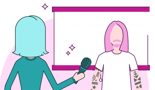

Mark Heaps taught a session, Essential Photoshop Tools, at Adobe Max. I would like to practice what he taught us in class. However, I teach at a high school and the website he gave us http://bitly/Heaps-PS-essentials is blocked by my county. I did not save the file to complete the lesson either. Is there any way he can send me the instructions to complete the lessons and the files?
That link opens this – https://drive.google.com/file/d/1nU1wvooSyZBHvNhTQwsWe_Hw2jgBhAjK/view which you might be able to access Gwendolyn? It has contact details for Mark there too.
Good luck.