Presentation storytelling with visuals of people
People are drawn to people so reinforcing your presentation storytelling with visuals of people is a sure fire way to engage and persuade your audience.

This blog post will teach you how to make an effective infographic in PowerPoint. Humans have used pictures to communicate for thousands of years – from pictograms on cave walls to eggplant emojis – so it’s no surprise that we often use infographics to share information. However, if you’re not a graphic designer, or you don’t have the budget for one, turning raw data into something visual can be a daunting task. These guides will show you that creating a beautifully visual infographic in PowerPoint is much easier than you think.
Watch the full demo here or scroll down to read a step-by-step guide.
Let’s imagine there is a meal planning service – called MealCarbon – who want to create an infographic that’s easily digestible for potential customers. They’ve got a title, some comparisons of portion sizes, and a tagline to promote their services.

The problem is that this is a pretty terrible way to display information – it’s just a list! However, if we take this information and spend a few minutes working with it in PowerPoint, we can make an engaging and visual infographic.
There are a couple of simple changes we can make to this infographic to immediately improve the way an audience would engage with it. One problem with the current layout is that there is little sense of visual hierarchy. How do viewers know what to look at first? Done well, an infographic is organised in a way that leads the audience on a journey, giving them information in managed steps. By separating out the tagline and title, and giving them a bit of TLC, we can create a clear 3-part structure which helps the viewer know what to look at when. (Read more about visual hierarchy)
Creating a footer
The first step is to create a footer. By placing the tagline next to the MealCarbon logo, the company and their motto are visually linked.
A footer bar can be easily created by heading to Insert > Shape and selecting a rectangle, then resizing it to fit the proportions of your PowerPoint infographic. Next, drag the tagline on top of this shape and make sure the font is legible, making any key terms bold. Then, use PowerPoint’s alignment tools to make sure the text is centred perfectly. The correct alignment of objects can make the difference between your creation looking rushed and home-made or sleek and professional. Find the alignment tools under Shape Format > Align.
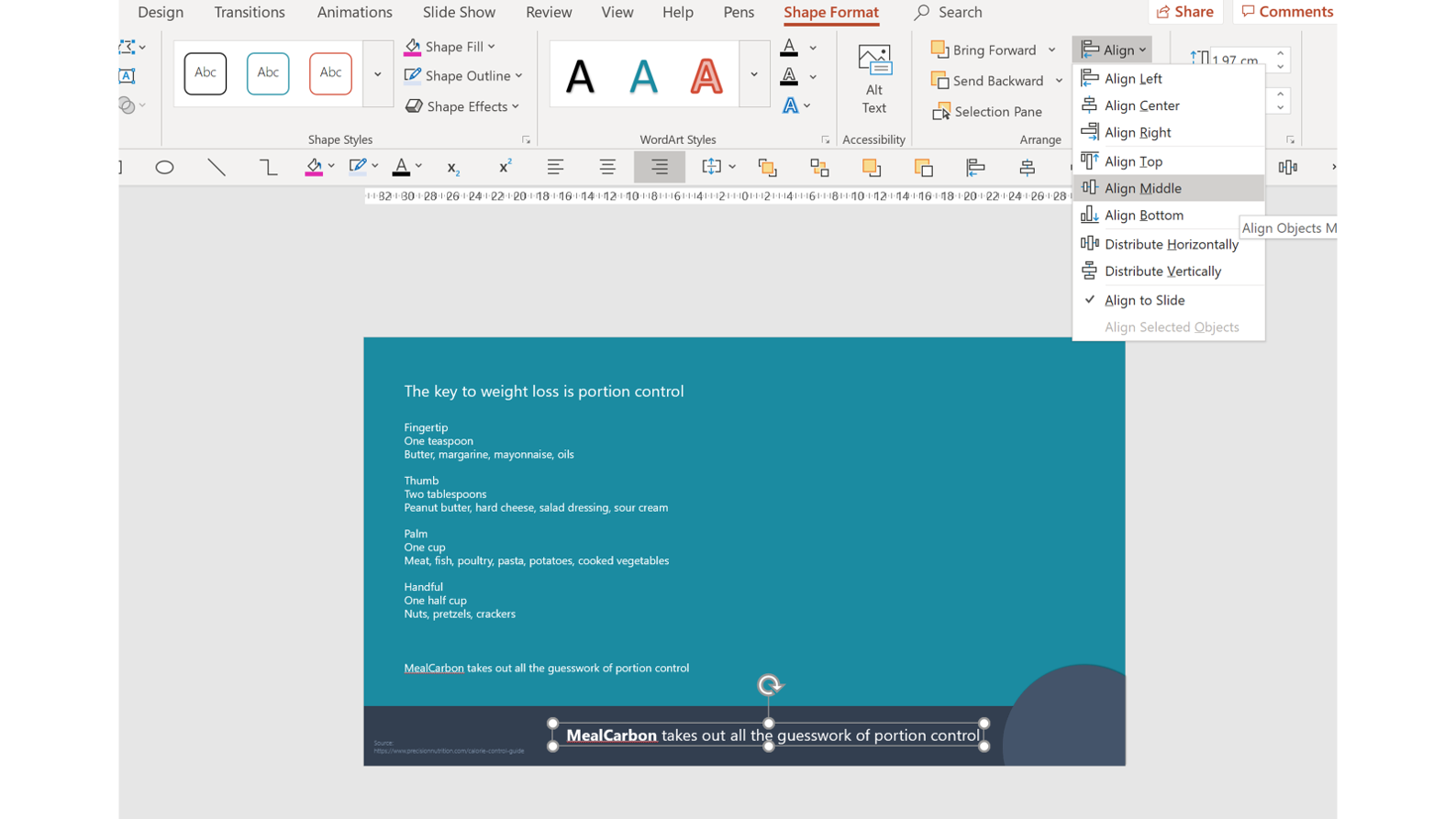
If you’re planning on making lots of infographics in PowerPoint, I suggest installing our Quick Access Toolbar. The Quick Access Toolbar allows you to easily access some of the hidden functionality in PowerPoint, and it contains the alignment tools along with a bunch of other useful functions. Download it here.
Now we can move on to the title. We want it to pack a punch without distracting from the main content of the infographic. Luckily, PowerPoint has a range of tools that will help you create lovely typographical effects in just a couple of minutes.
For this title we’ve used PowerPoint’s character and line spacing options to create a stylish look. Find the character spacing options by selecting a text box or section of text and clicking on the Home tab.

Select Very Loose then make your text all capitals for a less “PowerPoint-y” stylistic effect.
The line spacing options are a little trickier to find. Select the piece of text you want to edit, then find the Paragraph section under the Home tab. In the bottom right-hand corner, click the little arrow to bring up all the available options.
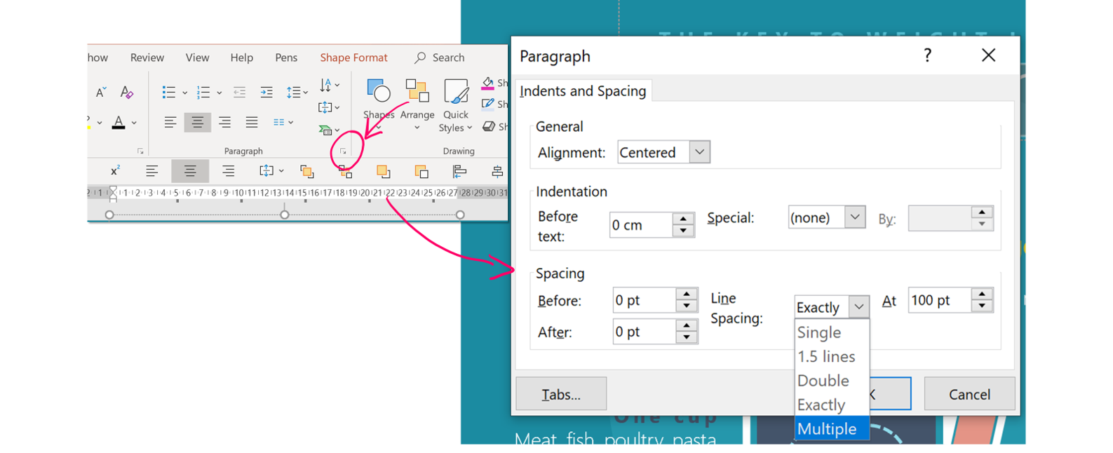
To create a nice effect that doesn’t leave huge gaps between your lines of text, under Spacing > Line Spacing select Multiple. Then play around with the different values until you are happy with the result – we’ve gone for 0.9.
The final title looks something like this:
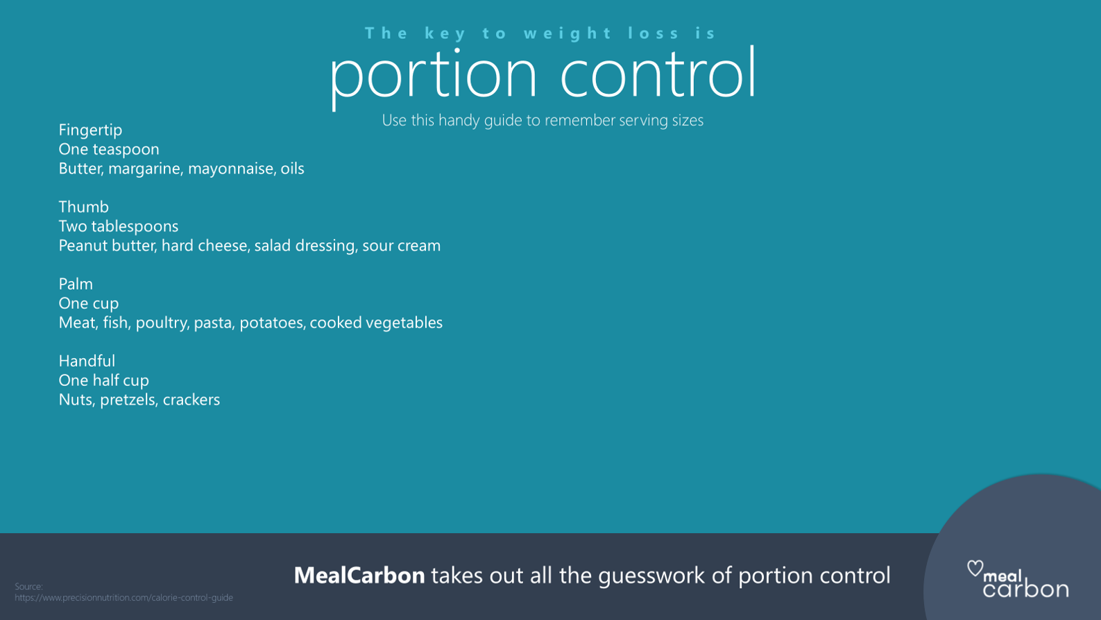
Better, but the content is still a glorified list. It’s time to bring in our visuals.
Depending on your content, deciding on the appropriate visual could be really easy or really hard. Before you start, read this blog post on data visualisation for inspiration. We’ve also got lots of resources on our website that will help you learn how to visualise all sorts of information.
My advice for visualising infographics is to keep it simple, and keep it relevant. For example, all of the portion sizes in this infographic relate to a hand. Helpfully PowerPoint (with Office 365) comes with an icon library (find it under Insert > Icons). Use this resource to get some decent, high quality graphics without spending any extra money.
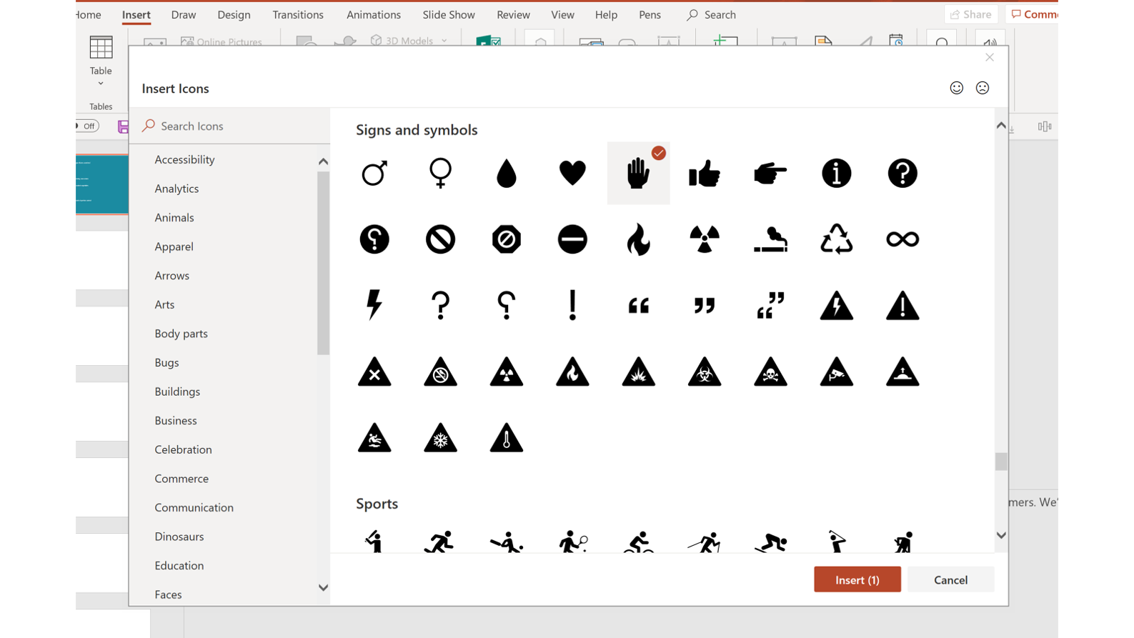
Because the in-built icons in PowerPoint are vectors, once you’ve inserted an icon onto your slide, you can resize it how you like, without losing quality. Another great thing about PowerPoint icons is that they can be edited like any other shape by changing fill colour and line colour. For MealCarbon’s PowerPoint infographic we’ve gone for no fill with a nice, clean white outline.
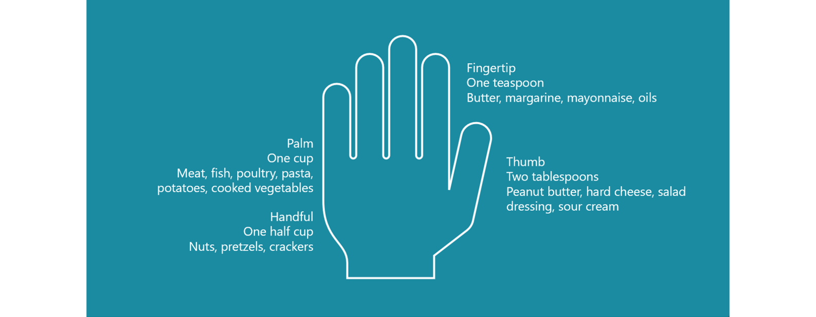
Already this simple visual is starting to work, helping the viewer conceptualise portion sizes much better.
We can step it up a notch, however, by using PowerPoint shapes to highlight sections of the hand. Let’s start with the fingertip. Now, there isn’t a shape that exactly fits the area but we can use PowerPoint’s Boolean tools to create one.
First, go to Insert > Shape and select a rectangle with rounded corners, then use the small orange dot to adjust the curvature. We just want the tip of this shape, not the whole thing, so we need to crop off one end. The Boolean tools are really useful for creating custom shapes in PowerPoint, so I recommend getting to know them well.
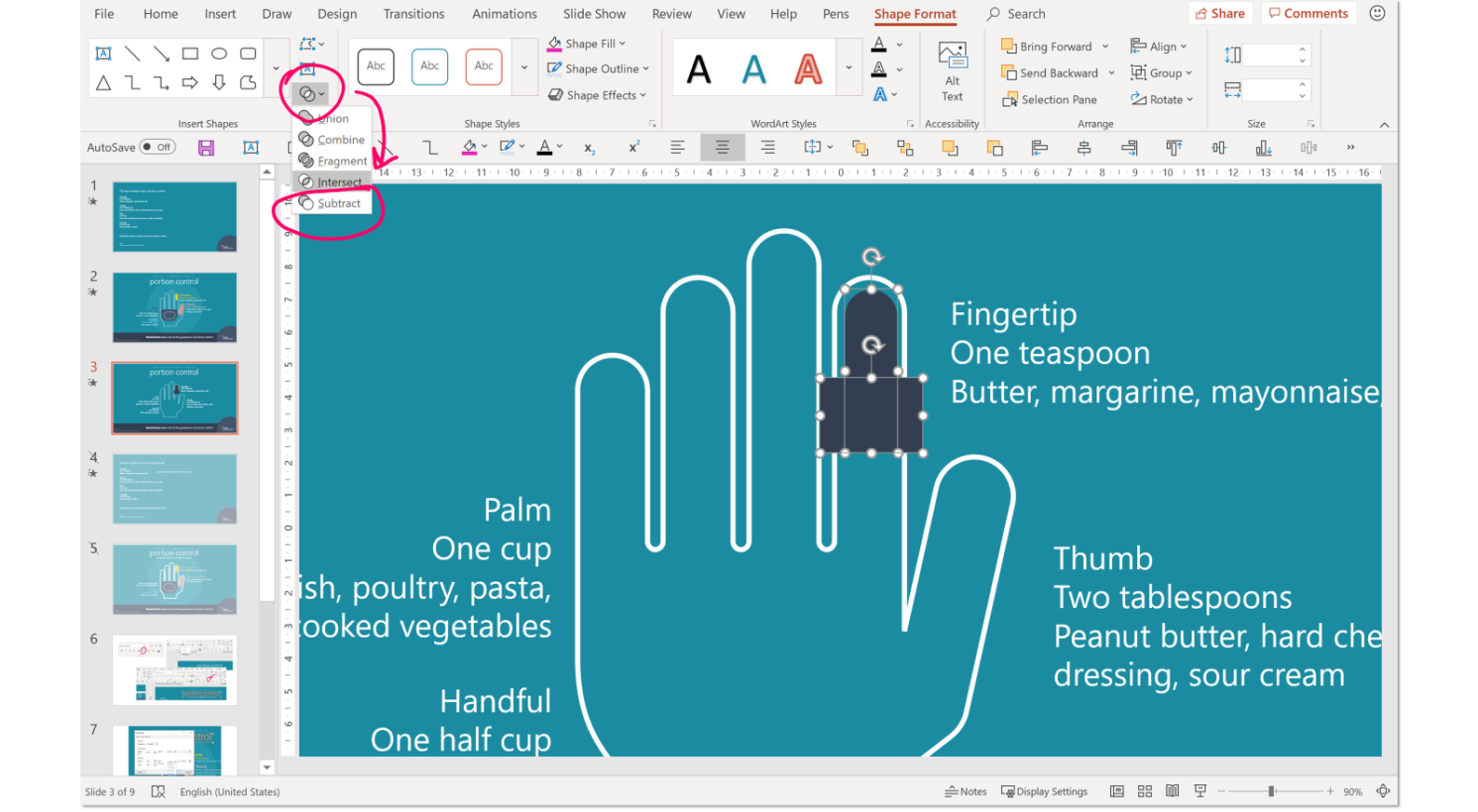
While holding down shift, select both shapes and under the Shape Format tab select the Boolean tools menu. Then, put a rectangle over the section that you want to crop and Subtract it from the original shape. We can do the same trick with the other sections to create a lovely, helpful visual.
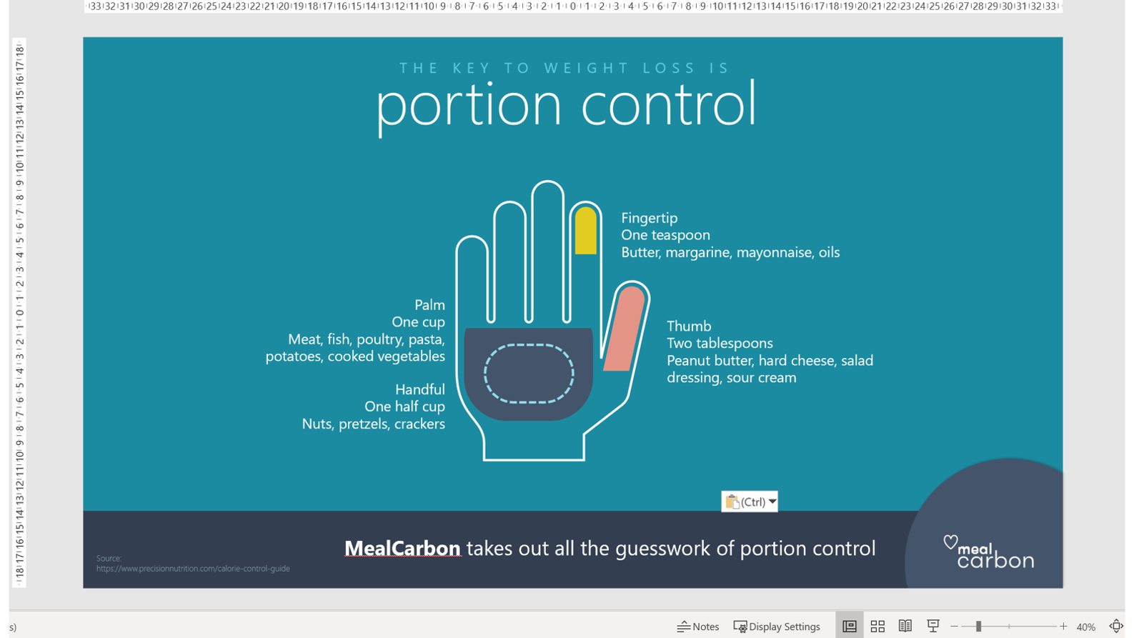
Now the bulk of the work is done (hooray!) but there are a few finishing touches we can make to polish the design. Firstly, create stronger visual links between the text and the graphic by colour coding the text. Then employ bit of simple text formatting to the information points.
Use the text formatting tips above to create some visual hierarchy, then copy the formatting to your other text points.
To copy and paste text formatting simply select your formatted text and press Ctrl, Shift + C, then select the un-formatted text and press Ctrl, Shift + V. This small productivity hack can save a lot of time when editing multiple sections of text.
As this PowerPoint infographic has a lot of white space, we want to ground the central visual so it doesn’t look like it is floating about. An easy way to do this is insert a shape behind the main visual in a slightly different shade to the main background. A subtle effect that helps focus attention to the centre of the infographic.
Our final product looks like this:
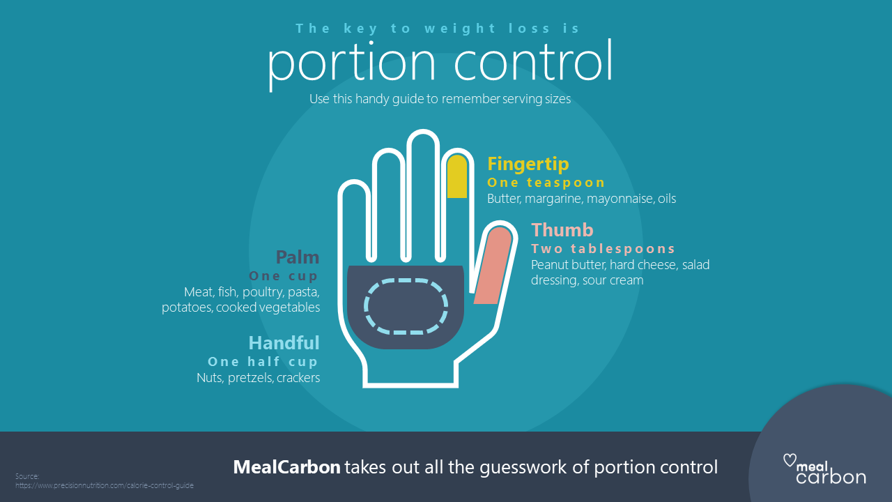
An attractive infographic, much more digestible than a list of information, created entirely in PowerPoint.
If you have any questions about the techniques used in this PowerPoint infographic tutorial, feel free to ask in the comments below.
Our blog post on why we need infographics
The Pudding – a great online publication that will make you rethink the way you visualise data.
Leave a commentPeople are drawn to people so reinforcing your presentation storytelling with visuals of people is a sure fire way to engage and persuade your audience.
Underwhelmed by the built-in slide transitions in PowerPoint? Or just baffled? PowerPoint has almost 50 transitions to choose from! A few of them are tasteful, but many of them are cheesy and distracting. Create your own instead with this helpful guide.
For those of you with PowerPoint 2016 and an Office 365 subscription, you may have noticed that the latest update bestowed upon you a new transition—Morph. Though unassuming, this feature possesses great power. Let's take a look at what it can do.
Join the BrightCarbon mailing list for monthly invites and resources
Tell me more!The video animation looks AWESOME! Thank you sooooo much. I am very happy and proud with the result; this video is really convincing. Really really well done.
Elodie Maurer SES

Can we have the step-by-step for the Clock Visual, as part of the same session? I can’t find that anywhere.
Thanks for this information regarding infographics templates