How to level-up your presentation visuals
- Visual communication
- Comments: 2
Relationships are everywhere and if you can crack how to show relationships effectively on your slides then you’ll have your audience swiping right instead of left.

No matter how good your content might be, if it doesn’t look good you’re going to put your audience off even before you’ve started speaking. Here are three design hacks that will have you creating professional-looking presentations in about half an hour.
Before we start, I’m going to admit to you that I’m not a designer. BrightCarbon has a whole host of excellent designers that will be able to tell you all about image manipulation and kerning. But after working closely with all of them, I’ve learnt some great design hacks that non-designers (like you and me) can use to make dull slides look engaging.
And one more thing… a lot of the tools used in this tutorial are hidden in the depths of PowerPoint. Download our Quick Access Toolbar to get these useful features in a ribbon of convenience at the top of your window.
Gross. Calibri bullet points on a white background with a cacophony of supposedly helpful illustration that looks suspiciously like clip art. Kill me now.
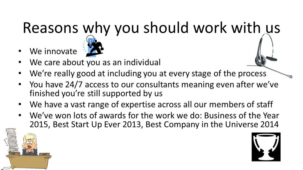
White can be a very stark colour if you don’t have other bold design elements on your slide, it makes it very obvious you haven’t thought about design, or that you’re just too darn scared of it.
It’s amazing what a nice picture can do to make your presentations look more professional. There are plenty of stock image websites around that will help you choose a picture to put as the background of your slide. You can even head to Google and do a Creative Commons search for free images (just make sure you read all the terms and conditions. And don’t be that guy – make sure you pay or give credit for what you use). Check out our blog post for more tips on how to create a professional and sleek slide background in 3 different ways.
Do: Choose images in-keeping with your brand colours. Try and make sure your picture is relevant, but not fake – Photoshopped hills and airbrushed models are becoming the new clip art #justsaying…

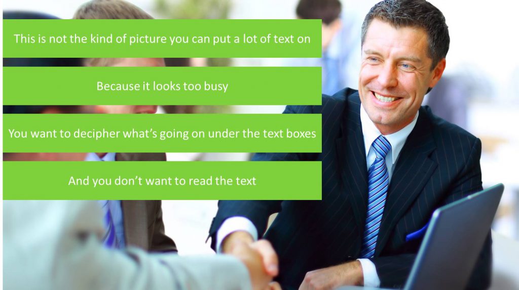
Don’t: Choose a busy picture! If there’s a lot going on it will just end up being a distraction for your audience. Instead, you might want to choose a picture with the focal point on one side so you can put text on the other side.
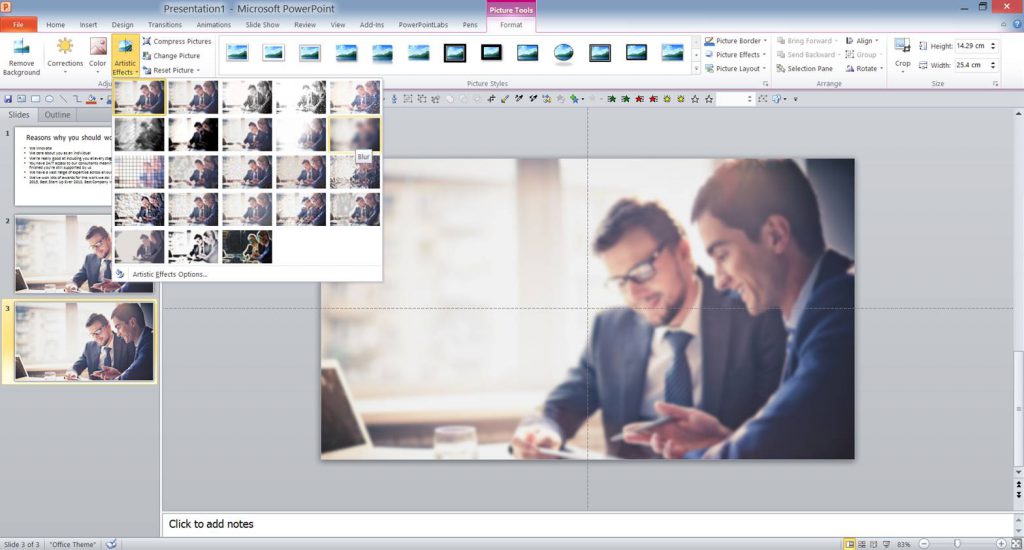
Advanced tip: To give a really professional look duplicate your image (Ctrl+D) and go to Artistic Effects on the Picture Tools tab at the top of your window. Choose Blur and add a Fade animation After Previous to your blurred picture (your original picture doesn’t need animating). Now you’ll transition to your new slide with your picture, it will then blur out and your content can appear distraction free!
We hate bullet points at BrightCarbon. They look so 90s and it’s really hard to pace the information so that you’re not giving away your punchline before you’ve started talking. But we understand that sometimes you just don’t have time or enough expertise to think of interesting ways to display your content.
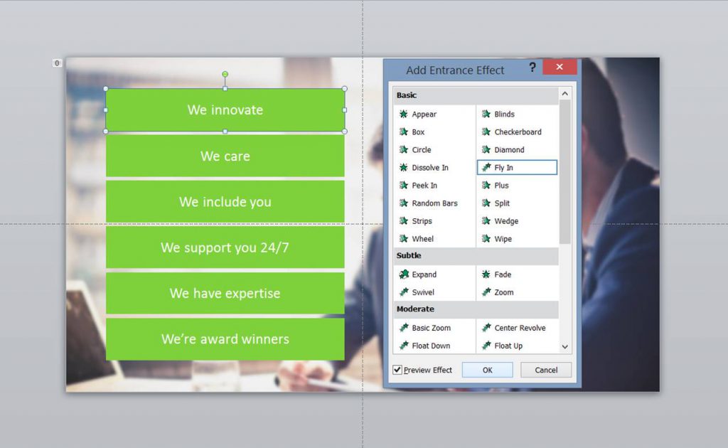
So our next professional presentation hack is this – make each bullet point a separate box. Draw a rectangle and type your text in the box. Get the proportions right for your content and then duplicate (Ctrl+D) the box, line it up under the first one and then duplicate again until you have enough (change the text too, obvs).
Now add an animation to each of them – we like Fly in. Have them fly in from left or right (depending on which side they’re on) and have them come in after each other, or on a click. This will help you pace the information.
Do: Try and cut down the amount of text you use – check out our top tips here. If you’re going to be talking through the points, put brief notes on your slide and NO MORE! It’s only there as a guide and a reminder for your audience. Another great design hack is to reduce the size of text on your slide – your audience can read size 16 quite easily, so you could even go down to size 14 without causing eye strain. Big text makes your slide look like a primary school project #fact. Take a look at our more in-depth recommendations for text size in our article here.
Don’t: Don’t create text boxes in different sizes or shapes – it looks messy and unprofessional. Don’t rely on your own eye to line them up as well. PowerPoint has some great alignment tools to make sure that there is an even amount of space between each box, and that they’re all lined up according to the same point.

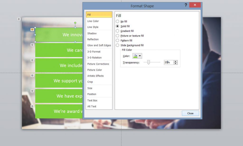
Advanced tip: Once you’ve chosen a colour for your boxes right click and choose Format Shape, choose Shape Fill. You’ll see a scale, this will adjust the transparency of your object – drag the slider to 25%. This will make the edges of your boxes seem less harsh.
Confused illustration and different styles really can make your corporate presentation look like your child’s IT project. BAN CLIP ART. In fact make it illegal. Instead find yourself some nice icons. You can find them on stock image websites, or if you’re feeling adventurous you can try making your own with PowerPoint shapes. Read this blog post if you want to find out how to create your own custom set.
By choosing a set of icons you can create a visual language to help understanding, but you’ll be using a coherent style (and it will look like it’s been through a design agency).

Once you’ve chosen your icons (one for each concept, and keep it consistent throughout your presentation) create a square box (the same height as the boxes we made earlier). Put the icon on top of the box and use the alignment tools to centre everything. Group the two items together and add a Zoom animation to happen With Previous. Move it in the animation pane to happen at the same time as the corresponding text box appears.
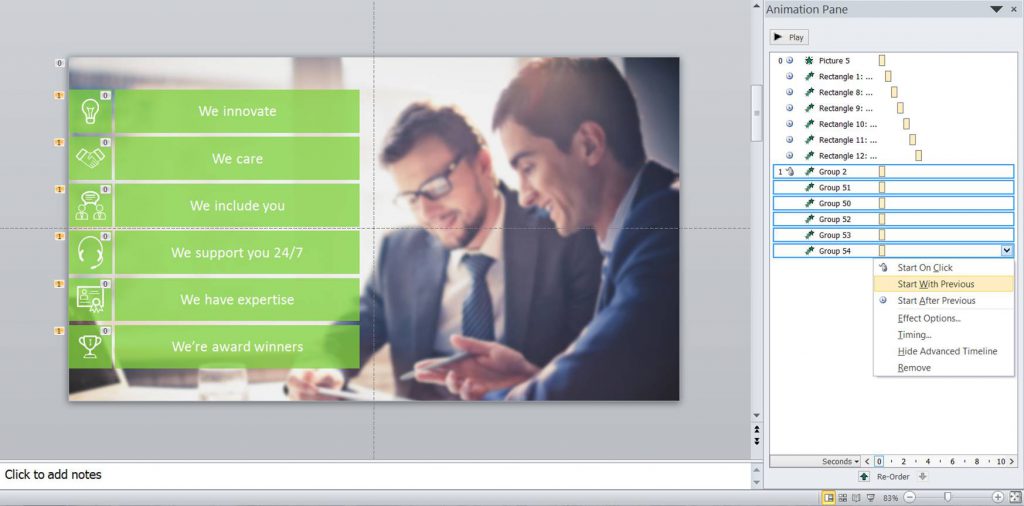
Now you should have something that looks like this. We’ve gone from basic to could-have-been-done-by-a-designer in three steps. Have a go at making your presentations look more professional with our hacks, and once you get used to them, try experimenting with different layouts and sizes. Even though you’ll be using the same three simple principles, you’ll be adding loads of variety. Trust me, your audience will thank you for it.
Watch a video comparison of the before and after:
And if you want to see a cool SlideShare of this article, head on over here.
Leave a commentRelationships are everywhere and if you can crack how to show relationships effectively on your slides then you’ll have your audience swiping right instead of left.
This article is dedicated to the bit hitting combination of PowerPoint and PDFs, and three particular use cases that will have these two giants working together in perfect harmony: how to convert PowerPoint to PDF on Windows and macOS, how to convert PDF to PowerPoint, and how to insert a PDF into PowerPoint.
As humans we find stories incredibly compelling, but why is that? And how can we make sure we're infusing storytelling in our presentations to keep our audiences engaged and invested? Read on to find out the rest of the story!
Join the BrightCarbon mailing list for monthly invites and resources
Tell me more!Thank you for today’s PowerPoint productivity masterclass. I’ve learned so much from BrightCarbon when it comes to PowerPoint. If there isn’t a BrightCarbon fan club already, I’ll be happy to start one!
Kimm Babo Wegmans Food Markets

Great tips, Thank you very much.
Yes, I like it
Thanks for the support
Simple yet useful, thank you,,
As always, very useful! Thank you so much for sharing!
Great tips looking forward to trying them out when designing my next workshop