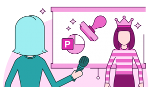
Take it from those who live and breathe presentations, these unhealthy presentation creation habits aren’t doing your decks any good!
Pasting text and graphs as images
On behalf of anyone who might need to use your content in the future, we beg you not to make a habit of pasting text or graphs as images! Why? Let me tell you:
- It makes the content impossible to edit. If a graph needs to be updated with a few new figures, you have to start from scratch.
- If the images get compressed at any point, they can end up looking blurry (and ugly) and be difficult to read.
- You can’t update the colours to match a new design style.
- And finally, the content can’t be animated properly, meaning it’s harder to present and less engaging for your audience. Check out this blog post on animating graphs in PowerPoint to see what we mean!
A note on charts specifically: When you paste a chart from Excel you have the option to Link or Embed. Link means that the data stays in your Excel file and only people with that Excel file will be able to access the underlying data. Embed means your entire Excel workbook is pasted into your PowerPoint, so anyone can access all the data. The latter option is good for wider editability, but there are security risks, so choose wisely.
Using too large text
There’s a delicate balance to strike when selecting font size for a presentation. We’d recommend not using anything below size 14 as it will be too small for your audience to read. And if your text needs to be size 10 or 9 to fit on your slide – you’ve got too much content on the slide!
However, some people go too far the other way and have ginormous text that completely dominates their slides. You want to make sure that your text enhances and supports the visuals you’re using, rather than completely overpowering them. To pick the right font size for your screen and room set up – head to this super helpful guide from Dave Paradi.
Using very large fonts also makes it more difficult to create levels of hierarchy in your text-based content. Bigger objects demand more attention, so your audience will interpret bigger text as being more important. If all the text is huge, the audience will spend so long trying to determine the relationships and order between the information that they won’t take much of it in.
Read more about using text and fonts effectively in presentations.
Deleting and/or moving placeholders
If your template is set up properly, it will be constructed around guides (not sure what they are? Read more here!), and all the placeholders set in a specific place to look balanced and professional.
When you start to move these elements around, particularly if you’re not paying attention to the guides, your slide elements can easily look awkward and haphazard.
If the changes are made well and consistently within one deck for a one-off presentation, it’s probably not a big deal. However, if you copy and paste slides from a deck with edited placeholders into one using the original template, they will stick out like a sore thumb! This can distract your audience and make you look unprofessional.
Things like titles, page numbers, logos and footers are best left where they are.
Removing animations
Contrary to popular opinion, animations (done well) actually make a presentation easier to present.
We know old habits die hard but if your deck has been lovingly created by presentation experts like BrightCarbon, the animations are there for a reason! Animations often either help stagger the information on a slide, so you can control what part of the story your audience sees when, or help tell the story showing movement, change, processes, or progress.
Take a few minutes to click through the deck and practice the content alongside the animations, rather than panicking and removing them completely!
Just a note – this does not apply if the animations you’re removing are cheesy or dated (PowerPoint’s boomerang animation and origami transition – we’re looking at you!). Replace these with a simple fade.
Presenting in normal view/edit mode
If there’s just one thing you take away from this post, let it be this: only present in show mode! There’s nothing that ruins a good slide quicker than being seen in edit mode. It looks messy, the slides are far too small, and the audience is distracted by everything else going on on the screen. The branding that leaves an impression is that of the presentation creation platform rather than your slides. We’ve got a handy blog post all about how to present well using Presenter view in PowerPoint and the present mode toolbar in Google Slides. We’ve also got lots of presentation skills tips and tips on presenting virtually. There’s no excuse!
If you’re presenting in the normal view because you need to jump around your deck, consider adding an interactive menu so you can hop between slides without exiting show mode. We’ve got tutorials for this for Google Slides and PowerPoint if you want to have a go or BrightCarbon can create an interactive presentation for you if it’s a bit beyond your current skills. No judgement!
If you’ve been looking for one, this is your sign to kick those bad presentation creation habits for good! And, if you need help making new habits second nature, join our free masterclasses for demos, tips, advice and Q&As from our experts.
Leave a comment


