I’ve travelled the world training people on ways to improve their presentation design. I see people with a range of backgrounds, skills, and experiences but there’s something thing that 99% of attendees have in common. They don’t use a mouse! Though I’ll keep those offenders anony-mouse (sorry), I’m dedicating this blog post to the simple but powerful art of the mouse.
Getting yourself a basic computer mouse is one of the quickest and most effective ways of revolutionising your presentation design. Think about it, no graphic designer in their right mind would work in their creative programs without wielding their mouse like a mighty sword.
When it comes to presentation design, your priorities should be no different. But many people don’t think creating a slide deck is a design process. However, good presentation design requires precise, accurate, fast work. This is not made easier by sweaty fingers stumbling over each other on a too-small trackpad.
Even if you’re highly skilled at speeding your fingers over the trackpad, you’re still missing out on some of the benefits a mouse can bring. Here are five of the key ways using a mouse can transform your presentation design.
Increased accuracy
Trackpad users spend countless hours wasting time trying to painstakingly align objects with one another just to nudge the objects out of place as their finger leaves the trackpad. With a mouse you have so much more control over your micro-movements, meaning you can work quicker and more precisely.
The Scroll Zoom
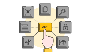
Using a mouse gives you access to a few practical shortcuts to streamline your presentation design process. Here’s one: simply hold down the control key (CTRL) and use the scroll function on your mouse. You’re now able to home in on an area of detail and zoom back out again with ease!
The Click & Drag
Clicking and holding down on your mouse whilst moving the cursor allows you to draw shapes and select areas much more easily than depressing the trackpad while moving your finger around it. This means you can speedily work on slides and effortlessly use tools like PowerPoint’s Freeform shape.
Quick keys
There are some helpful shortcuts that improve productivity in presentation design that can be carried out using your keyboard and mouse. For example, using the shift key whilst enlarging an object to ensure accurate scaling can be really helpful. We have even more useful tips for keyboard shortcuts in PowerPoint and Google Slides to help increase your efficiency. Even with these time saving tricks, you’ll probably end up wasting more time than you save if you’re fiddling with the trackpad.
The Magnifier
Windows has a great Magnify feature you can control using your keyboard and mouse. This technique is useful for showing people data sets with small text sizes, complex screenshots, or a live program. It helps your audience to see things more clearly and allows you to focus their attention on just the important elements on the screen. It can be a bit tricky to set up, but once you have, you’ll never look back. Read our how to guide for step-by-step details.
Better presentation design, better posture
Once you’ve selected a comfortable, ergonomic mouse, why not go the whole hog and invest in an external keyboard? Freeing up your laptop to be used predominantly as a monitor allows you to raise the screen and get the optimal posture your body needs. Whether you’re in the office or at the kitchen table, you should raise the screen (the top of the screen should be in line with your eyes when you sit up straight) to banish aches and pains caused by poor working posture.
Hopefully the importance of a mouse to presentation design has clicked (see what I did there?) by now! Of course, if you’re stuck on a plane or train and need the convenience of the trackpad to make some last-minute changes it’s okay to compro-mice (that’s it I promise!) and use the trackpad on the-go. However, for day-to-day presentation design, the humble mouse might just be your most important tool.
Leave a comment


A great insight. I teach people slide design and I use a mouse. No wonder they have trouble clicking on things!
Vincent, right on target. I am trying head over heels to get the young (millennial kids) colleagues to use a mouse because its so much more efficient. thank you