For many organizations, the days of giving face-to-face presentations for every meeting are over. Though face-to-face meetings are still a powerful communications tool, conference organizers, marketing teams, and B2B sales people can attest that virtual presentations are here to stay. However, attempting to simply give the same presentation online as you would offline is likely to result in a disappointing presentation that neither engages nor impresses your audience.
Throughout this article we’re going to look at some practical ways your teams can make an impact in an online era. If you want even more detail, we’ve compiled this, and more, in a report you can download for free:
These days web conferencing platforms are widely available, affordable, and really pretty good. But what effort is involved in making your in-person content online-ready? Sadly, we’re not talking about a lift and shift here, and to understand how content needs to change, we need to understand the differences between in-person and online presentations.
In-person
Online
What do you have?
A presenter, their slides, an audience in the same place
A presenter, their slides, an audience in different places
Presenter
Presenter can make the most of body language and presence.
Presenter lacks presence and gravitas from their tiny thumbnail window.
The presenter gets live feedback from the audience.
An audience on mute gives no feedback, presenter can feel they’re speaking into the void.
Slides
The presenter can interact with the slides to direct attention.
Presenters can’t interact directly with their slides.
The audience can see slides and presenter at once.
The audience has to flick back and forth from presenter to slides.
Audience
Social convention means audience members are unlikely to walk out – so they’re always present.
The audience can be totally unobserved and are subject to any number of distractions.
A live audience shares its energy – laughter, applause.
If someone tunes out, the rest of the audience can’t bring them back in.
All of this means that both the presenter and the slides must work much harder if they’re to keep audiences engaged, and that means the content you have for your face-to-face audiences has to change if it’s to be effective in an online setting.
In a sense all presentations can be thought of as the struggle of compelling content against distraction. Take a presentation online and it’s both harder to make the content compelling – because the presenter and slides aren’t in the room but just showing on a small screen – and harder to avoid distraction – because the audience are much freer to go off and do other things. So all we need to do is eliminate distraction and make our content compelling!
How to eliminate distraction
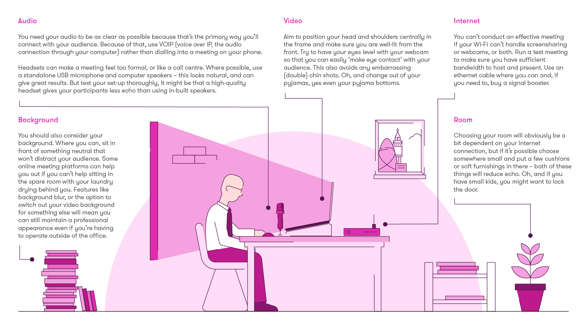
Your audience is in high demand: there are people wanting urgent responses to emails, friends trying to decide where to go for pizza that evening, the dog chewing the blinds – again. That means you, as a presenter, need to be on your a-game if you’re going to capture and hold the attention of your audience for the duration of your online session. For that you need a great set-up so you can present confidently without fear of interruption, but also so that your audience doesn’t have to work too hard to hear you or see you, and so that they can’t get distracted by trying to figure out what laundry you have hanging up behind you.
Best practices for an online set-up
We all remember the viral clip of Professor Robert Kelly being interrupted by his delightful children. Whether you’re presenting from a home office or from the office, ensuring you have the right set-up to host and attend meetings is a must. It’s not just about locking the door and throwing a smart jumper over your pyjamas, your online meeting set-up needs a little more thought. Here are some of the main things you should consider:
What meeting platform is right for you?
There are lots of online meeting platforms out there. Different platforms suit different organisations, but if you’re in a hurry to find the right one for you, we have a handy comparison table on page 6 of our report that you can use to review your options. It’s worth noting that Microsoft Teams is making a big push to help with slower connections (although it may not be a problem in a corporate office setting) by allowing you to share a PowerPoint file directly from OneDrive or SharePoint. That reduces the bandwidth requirements compared to full screensharing, which makes things much clearer and smoother for your audience.
How to create compelling content
The other side to running successful online sessions is to create compelling content. Even if the presenter is doing all they can to engage their audience, it still won’t be enough if their slides are a bit boring and plain. This means your slides need to be designed well and be animated.
How to design compelling slides
When it comes to design as a starting point, it’s easy enough to work out what we shouldn’t do: dull text-heavy slides that stay on screen for minutes at a time with nothing moving or changing. All you need is a monotonous voice in the background, and you’ve got a first-class remedy for insomnia. But, when you open PowerPoint and see the ‘click to add text’ prompt tempting you into a deep mire of PowerPoint hell, it can be really difficult to know what to do instead.
We have a wealth of presentation inspiration for everyone, from the entry levellers dipping their toes into PowerPoint, to those with real design know-how looking to get the golden ratio involved.
Presentation slides should always be visual, otherwise you just have a presenter giving a speech with a rubbish backdrop. But even if you have beautiful slides, if they aren’t dynamic, don’t have movement then you’re still asking your presenter (remember, the tiny person in the small window in the corner of a screen) to carry the energy of your session alone. If something is changing frequently on screen, audiences are likely to keep paying attention. Leave things static for too long and they’ll drift off. We think every 20 seconds is about the right frequency for something to change on screen, certainly no more than 30 seconds. These changes could be a major build, or a new slide. It seems like a lot of animation, but it really doesn’t feel like it for the audience. If animation seems scary, or worse cheesy, try to put those preconceptions aside. Animation doesn’t need to be a mystery and your audiences will be endlessly grateful that you put in the time to figure it out. We’ve got some great tips and hacks you can learn in a matter of minutes that will transform your static slides into dynamic content with just a few clicks!
With online meetings it’s worth adding a note about webcam etiquette. Throughout this paper, we’re assuming you’ll use webcam, but we can be a bit more nuanced than that.
Use video, but not where this distracts from your slides.
Use your webcam for introductions, for conversation, and to answer questions, but think about turning your camera off when presenting slides.
If you have access to a greenscreen or can videocast yourself presenting in front of your slides, consider that as an option – but please practice first!
In a much smaller meeting – like a sales meeting – turning on your webcam creates a social pressure for the audience to do the same, so as a courtesy make it clear that you are planning a video meeting when setting up the call.
On some online platforms you can set a picture as a background image – so you could set a static slide as your background. But hacking this function to display your slide show is high risk because of the set-up and rehearsal needed to make it as slick as possible. It can work well, however, if you use the background to bring up a key visual or stat during a Q&A session.
More recently Zoom has added the ability to incorporate a PowerPoint deck as your background, so you can superimpose yourself on the slides. It’s great, but remember, you don’t want to cover up key content, so you’ll probably need to design slides to specifically leave space for your video. Also, the slides are static with no animation, but you can split content over several slides to achieve ‘build’ effects.
Microsoft Teams has the same idea, but takes it a step further to incorporate animated PowerPoint presentations as your video background, along with different layouts you can choose from.
Presentation skills for online meetings
Online presenters need to avoid monotony. We used to think that for some presenters the best way to do that was to work hard to develop and refine a natural-sounding script. If you aren’t using video while you present slides, then there’s no risk of being seen reading. But very few people can deliver even the best script in a convincingly natural way. So, our advice is to:
Speak from notes, not a full script
Practice beforehand
Don’t read verbatim
To break up monotony further, consider playing around with the way you structure your content, and the format you use to present it.
Break up your material every five to eight minutes, so that attention levels don’t sag too much. A non-stop 30-minute presentation might make sense face-to-face, but it’s not going to work online.
Intersperse chunks of material with clean breaks in the content, use a change of speaker, or even an interview format – introducing content in response to pre-planned questions – to keep your audience engaged.
If you’re selling to a small group, show a few minutes of content at a time, and select this content in response to questions and the direction of the conversation. Create a visual conversation.
How to run an effective sales meeting online
Even with the best presentations, virtual events aren’t the same as their in-person equivalents: sales meetings can, however, come much closer. Online sales meetings can still feel quite intimate, people can jump in when they have a question or comment and, if you’re using webcams, you’ll probably be able to see the other people too.
But you still have to modify your approach…
The problem: in a sales meeting, your prospects are visible on webcam; because they’re observed it makes them less likely to be distracted, but that level of focus required much more energy. If you overwhelm them with too much information at once, they’re going to tune out and disengage from the content, no matter how visual it is.
The solution: Split your whole presentation into 3-4-slide sections and present based on what topics the prospect is most interested in, or where you see you can add most value. This keeps the pace and the energy of the meeting high, and you’re communicating to the prospect that you’re first and foremost concerned with their needs.
You can create a ‘visual conversation’ by presenting sections of slides then exiting the presentation and finding the next relevant section. Or you could create a menu slide and use hyperlinks so you can easily navigate around your presentation without having to exit show mode to find the slides you want.
Compared to sales meetings, events are much harder to move online without some people feeling they are missing out. This is partly because conferences aren’t just about the presentations and talks. People attend events for swag, networking, and the chance to learn from other delegates.
You also no longer have everyone’s undivided attention. Calendars fill back up again. Out-of-office messages get switched off. So what do you do? Here are three practical ways make your online sessions as effective as possible:
Schedule small discussion groups around certain topics, with cameras on so that delegates can still network and socialise.
Shorten your sessions. Give your audience breaks from their screen, and condense the content you have into shorter, more impactful sessions.
Make the most of your platform’s interactive features to make your session more engaging. You might want to do a quick orientation at the beginning of your session – point out what interactivity options there are and where to find them.
How to deliver hybrid presentations
Hybrid events aren’t new, but audience expectations have changed. Typically, people dialling in were somewhat ignored, but what was tolerated then won’t be tolerated now! The way to create compelling content is the same as when you’re presenting remotely: meaningful visuals, animation to impart meaning and keep things moving, interactions to help with pacing. It’s your set-up that needs some serious thought.
That said, how can you improve the hybrid presentation experience?
Make sure your audience can hear and be heard: Sound for hybrid presentations can be tricky because usually room conference phones are not great and having multiple mics open in the room at once can cause feedback. A Bluetooth mic can work well but only if you can manage muting and unmuting the room conference phone and your own mic when your audience want to ask questions. Don’t just assume that people joining remotely can hear – run a soundcheck beforehand.
Make sure your audience can see and be seen: Not only should your audience be able to see you, they should also be able to see other audience members and be seen themselves. With a single display room, use the display to show slides and (in a small view) the online audience. You might need to extend the presenter’s screen. If possible, use a webcam to make those in the room visible to those who aren’t. If you’re using two cameras one should show the presenter and the other show people in the room. Microsoft Teams is really trying to push this, with new views and layouts that allow remote audience members to be on the screen next to the main slides.
Leave the meeting chat on and use it: It’s important that your audience can ask questions and provide feedback. Have someone monitor the chat, field questions for the presenter, respond etc. Only encourage people in the room to join in if it doesn’t distract the presenter.
Consider having multiple presenters: Having one presenter in the room and one remote can ensure you’re not ignoring online audience members. The remote presenter can monitor the chat, respond to some points, advocate for the remote audience and present some of their own content to make it clear that remote participants are equal.
Summary
We’ve covered a lot in there, but to summarise, here are some key takeaways to remember:
Don’t just take what you would do face-to-face and try to do the exact same thing online. It makes a huge difference to attention levels and energy levels not being in the room with the presenter.
Slides presented online need to be visual, and they need to change onscreen frequently. We think every 20 seconds to keep things compelling.
Use natural breaks in content, or speaker changes, or interactivity, to keep sections short. This makes it easier for the audience to stay engaged.
Use video, but not necessarily while you are sharing slides. If you will want your audience to use video too, do them the courtesy of letting them know in advance.
If you move an event online, consider condensing some sessions, introduce breaks, and insert sessions specifically to make up for the lack of networking opportunities.
Think seriously about your set-up and make sure all audience members can see and be seen and hear and be heard.
Accessibility often ends up being an afterthought in content creation, but we’ve been thinking for a long time about how it can become part of your foundation when you’re creating presentations – or any other content – using PowerPoint. We’ve been talking to presentation guru, PowerPoint MVP, and anime fan…
Microsoft announced that Publisher is leaving us in October 2026. Read on for nostalgic Publisher memories and three great alternatives to explore before the Big Switch Off.
If you use PowerPoint a lot, chances are you’ll have seen your fair share of glitches and malfunctions. And nothing is so frustrating as losing work or precious time to PowerPoint crashes! So, after doing some of my own extensive research, here are the most common reasons why PowerPoint crashes and what you can do about it.
The text in that graphic of what to consider is too small to read (ironic?) on my 13″ laptop. Is there a larger version you can add that users can click on? Thanks. Connie


Hi Hannah,
The article references a comparison table of different online platforms for online meetings but I can’t see it, or a link to it.
Please could you point me towards the table?
Many thanks.
Hi Deanna – you can see the table on page six of this report – https://www.brightcarbon.com/wp/wp-content/uploads/2020/03/Moving-Presentations-Online-3-13.pdf.
I suspect it’s going out of date by the hour, but it gives a good starting point at least.
The text in that graphic of what to consider is too small to read (ironic?) on my 13″ laptop. Is there a larger version you can add that users can click on? Thanks.
Connie
Hi Connie – thanks for reading, and for the feedback. That image is now clickable, taking you to a full size version.