- PowerPoint design
- Comments: 3
Learn how to automatically generate total values for your graphs and charts using PowerPoint’s Combination Chart option.

If you’re tackling a home improvement project, you need to make sure you’ve got the right tools for the job. Trouble is, a lot of these tools come with a hefty price tag. It’s much the same in the presentation design world – expensive software and the rising popularity of subscription models can make it difficult to get high-quality assets for your slides if you’re on a budget. But help is at hand. There are some great free design resources out there – the ‘I can’t believe it’s free’ kind!
Our expert presentation designers have collated a list of their favourites for you to use in your next slide deck. From everything from photography, to icons, to colour schemes, these websites have got you covered!
Stock photography is a really useful asset when creating visual slides. The right image can help you to bring to life the story you’re communicating to your audience. But when approaching presentation design on a budget, paid stock image sites can easily send your costs skyrocketing. You need high quality photographs to make professional-looking slides, but finding these cheaply and legally can be difficult.
Unsplash is an incredible free stock imagery website. While it’s recommended that you credit photographers, who are giving away their work for free, all the photographs on this website are under a Creative Commons Zero License, which means they can be used anywhere, anytime, for anything! If you need a bit more information about Creative Commons licenses, check out this post from our blog archive.
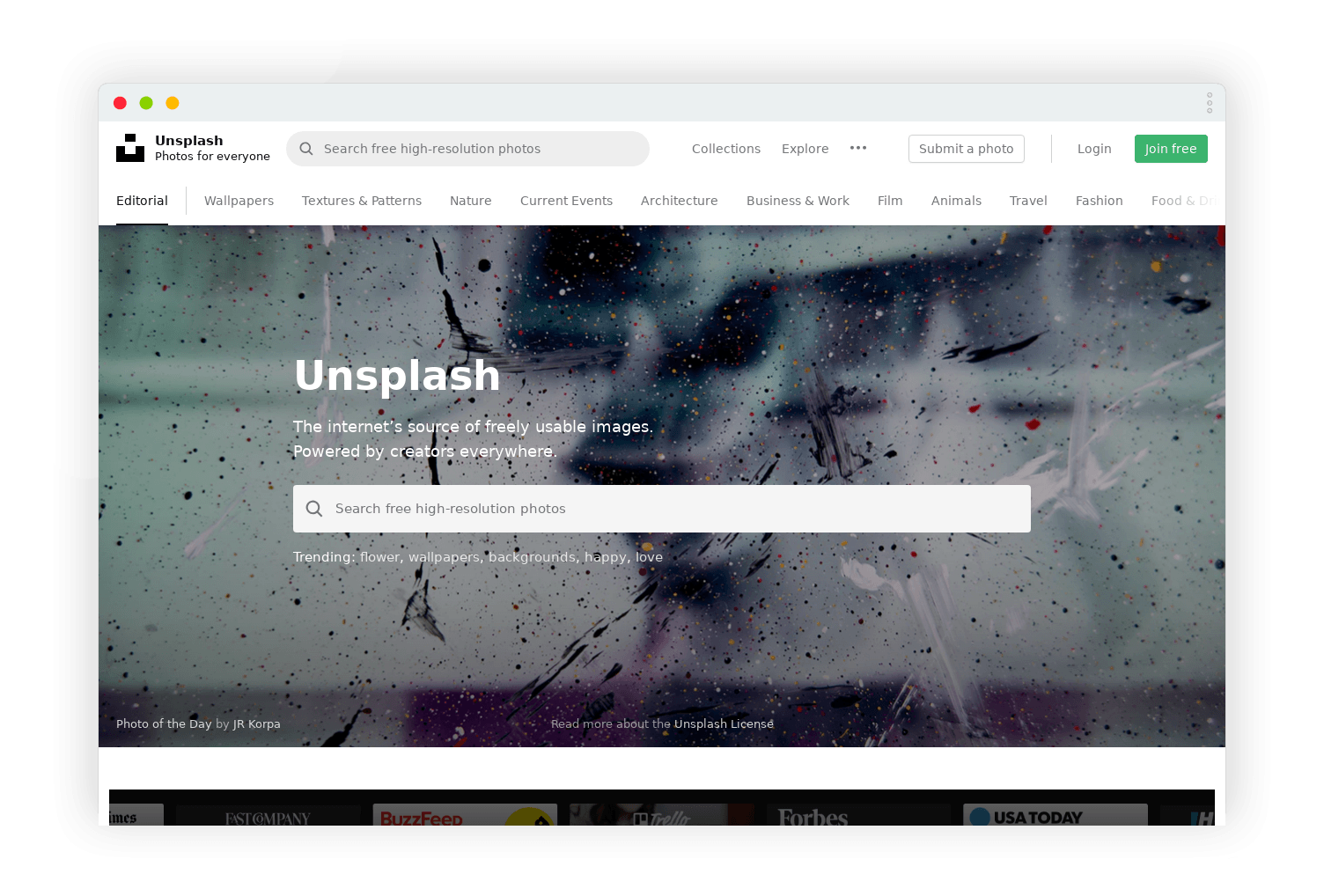
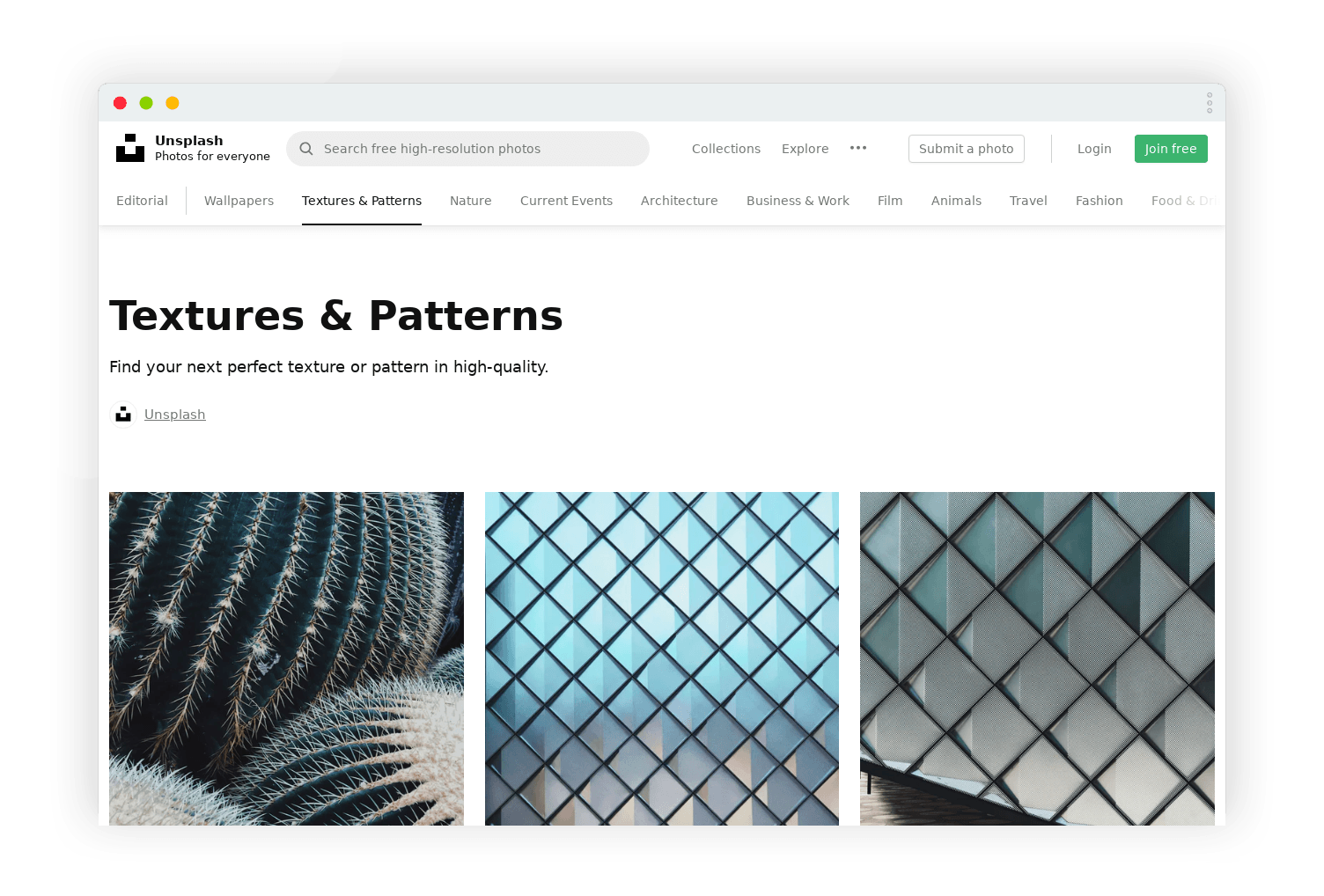
Unsplash is chock full of beautiful, high resolution images that will enhance your presentation design. You can search the library by keyword, or browse images around themes such as nature, travel, arts and culture, or textures and pattern. Users also curate collections of images, which can be helpful for finding what you need. There’s a huge range of images available on Unsplash, from abstract imagery that make great, unobtrusive slide backgrounds, to lifestyle shots that can be used as the basis for a visualised slide. The textures and patterns section has lovely images to add depth and dimension to your presentation template.
One tip from our presentation design experts is to make sure to compress any files that you download from Unsplash; otherwise, your presentation will be huge! You can do this in PowerPoint by going to Picture Format tab, then selecting Compress Pictures, or by using another piece of image editing software.
If you can’t find what you need on Unsplash, try one of these free design resources.
 | PexelsFree stock photos and videos you can use for personal or commercial purposes.
|
 | PixabayOver 1.8 million photos and videos available for download.
|
 | Life of PixHigh resolution photography and video with a handy filter-by-colour option.
|
 | StockSnap.ioA curated bank of free stock photography with new images added weekly.
|
 | ReshotHandpicked ‘non-stocky’ photography free to download and use without attribution.
|
| | Every PixelStock image search engine with free and paid results pulled from other websites. An algorithm excludes dated photos.
|
 | BurstHigh-resolution imagery organised into Collections.
|
 | GratisographyThe world’s “quirkiest” collection of free stock photos for when you’re looking to stand out.
|
Icons are a really useful way to represent concepts on your slides, but it’s important for all the icons you use to be consistent. Whether you choose a sketchy style, simple flat shapes, or line-based icons, keeping the icon style the same across your deck will keep it on-brand and ensure your audience is paying more attention to the story your icons are helping to tell than to the visual inconsistencies on your slides.
But unless you have an in-house department dedicated to design, building a library of consistent icons for all the different concepts you want to communicate can take a lot of time and money. Luckily, there are some great libraries of free icons that you can use in your next presentation.
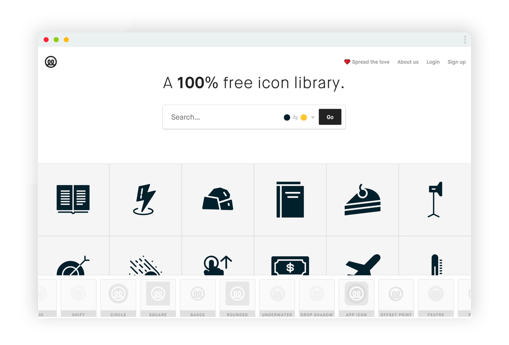
Illustrio is a free icon library, and it’s one of our favourites. All you need to do is create a free account, and then you can search the library easily to find the icon you need, changing the colours and style of the icon to suit your brand.
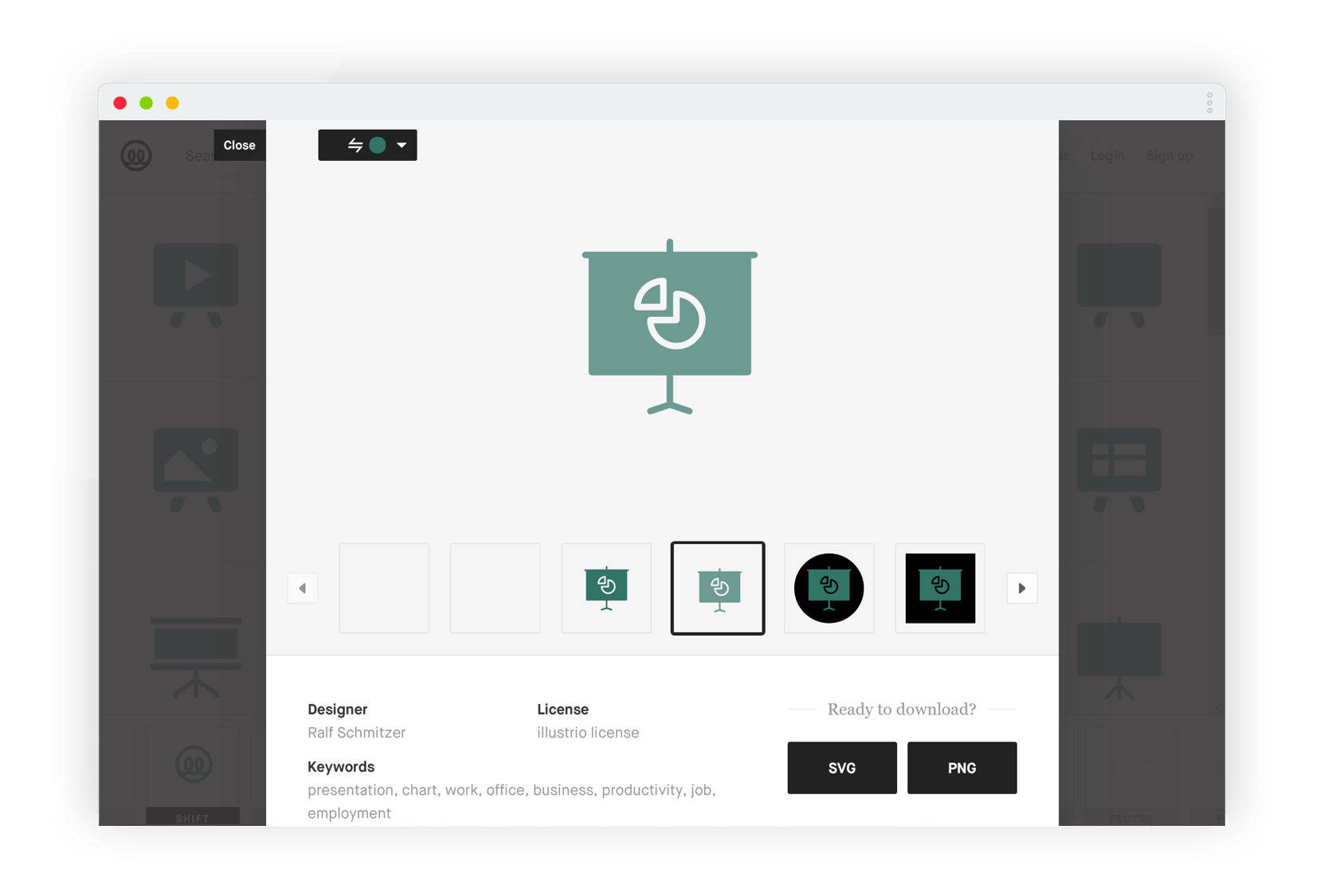
Once you’ve set the colours and style, you can then download the icons as SVG or PNG files. If you’re using the icons in a PowerPoint presentation, we’d recommend downloading the icons as SVG files. When you insert an SVG file into PowerPoint it creates a Graphic that you can edit in the same way as a standard PowerPoint shape; you can change the size, colour, line width, etc. without compromising quality. This gives you added flexibility and saves you time.
Illustrio isn’t the only option for free icons, though. Two more completely free and open sites are:
Endless IconsLots of useful icons organised into ‘sets’ by theme.
| |
 | Material DesignThese icons can be used on slides but are excellent for creating consistent, easily understood user interfaces. This could be really useful for an interactive deck or eLearning project.
|
The following sites have great free icons, but you must attribute the creators:
 | The Noun ProjectOver 2 million icons at your fingertips. The Noun Project has Microsoft, Google and Adobe integrations.
|
| | Orion Icon LibraryLots of lovely icons available in different design styles.
|
| | Flat IconMillions of icons available in a lot of different formats. There are free and premium packs available.
|
Icons8Free icons, photos, music, vectors and more. All icons produced by a single team so they are consistent.
|
If you want to give your presentations a really bespoke feel, then non-standard fonts, graphics, and themes will help you to achieve a custom look. You’d probably expect to pay a premium for custom assets, but there is at least one place where you can find beautifully crafted design assets for free. Creative Market is a marketplace for ready-to-use design assets, including graphics, fonts, and themes.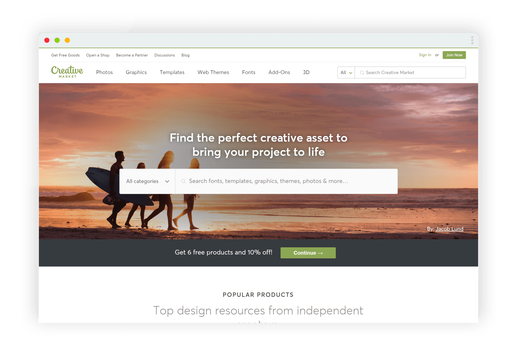
You have to pay for most of the elements on the marketplace, but Creative Market do weekly giveaways which are too good to miss. Every week there are new bundles of design elements that you can download for free. To access these downloadable design bundles, all you need to do is create a free account and then check back in weekly to see what they have in store. It can be hit-and-miss, but you might just discover something that meets your needs perfectly.
 If you don’t have the patience to wait it out for your dream font to appear in the Creative Market giveaway, check out our roundups of the best presentation fonts for PowerPoint and Google Slides: all of standard fonts, so you can use them right away!
One of the first things to tackle when setting up a PowerPoint template is the colour scheme. If you aren’t working from corporate brand guidelines, then you have many options to choose from when it comes to colour. The built-in PowerPoint colour schemes can look tired, so creating your own scheme is a great way to make your slides look unique and original. But choosing a set of theme colours can be intimidating for those of us who didn’t study colour theory or go to design school.
Understanding which colours complement each other is a skill that takes years to master. Luckily, Coolors is a website where you can generate colour schemes in no time at all!
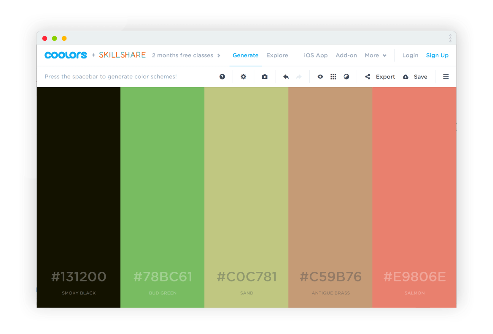
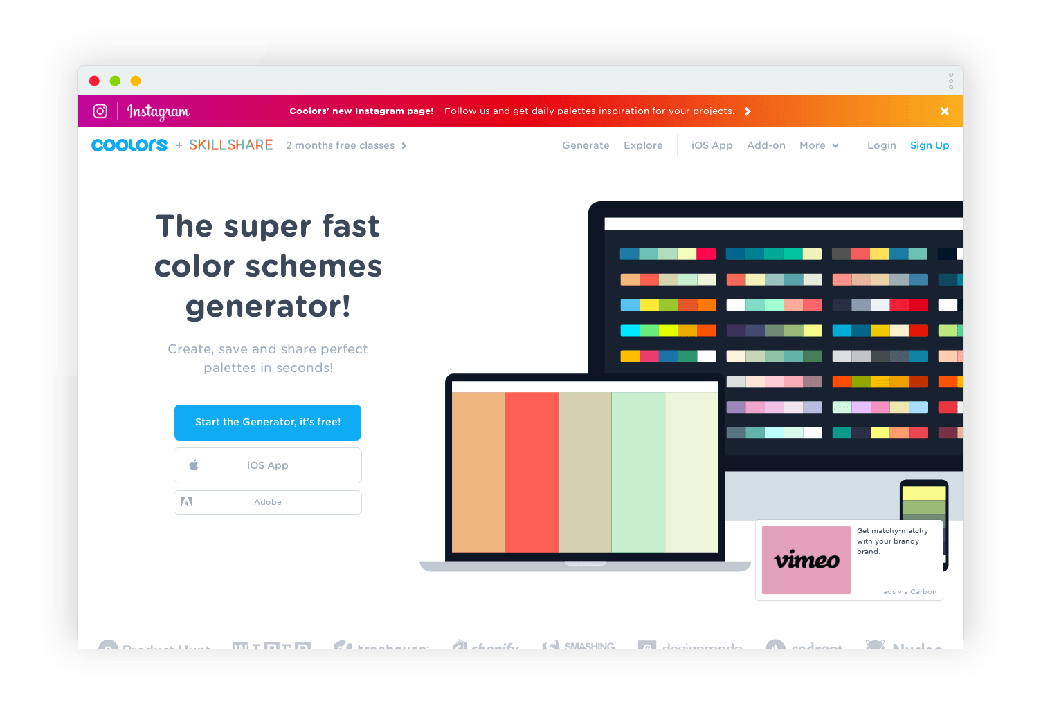 The Coolors app generates complementary colour palettes. You can start from their automatically generated colours, pick colours from an image, or input the HEX value of a colour you like. For example, you could add the colour of your company logo to the palette as a starting point. Then you can lock the colours you want to keep the same, and press the space bar to generate the rest of the palette. Just keep pressing the space bar until you get something you like!
Coolors has settings to simulate for colour blindness, including different types such as protanopia, deuteranopia, etc. This is a great feature for accessibility, and ensuring you’ll have enough contrast between colours in your slides.
You can save colour palettes you like to your account and export them as .PDF, .PNG, .SCSS & .SVG file types. These will include HEX, RGB, and CMYK codes of all the colours, which you can use when setting up your colour theme in PowerPoint.
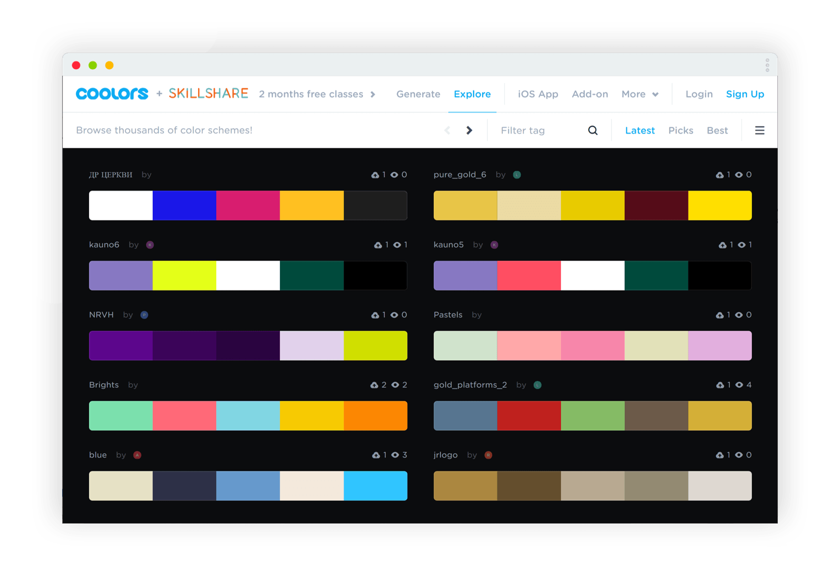
If you are struggling for inspiration, you can explore other user’s palettes, too! The Explore tab at the top of the site takes you to a huge, shared library of themes, which you can search by keyword to find the right fit for your slides.
Sometimes, you need screenshots in a presentation. Maybe you’re showing the audience what your company intranet looks like, discussing the benefits of a strong social media presence, or sharing an online news article that backs up your argument. Screenshots can look flat when inserted onto your slides straight from your desktop browser. A nicer approach is to wrap your screenshots in a mock-up of a browser window: but this takes time and design finesse to get right.
Screen Guru gives you a quick and easy way to create a mock-up browser window of any webpage.
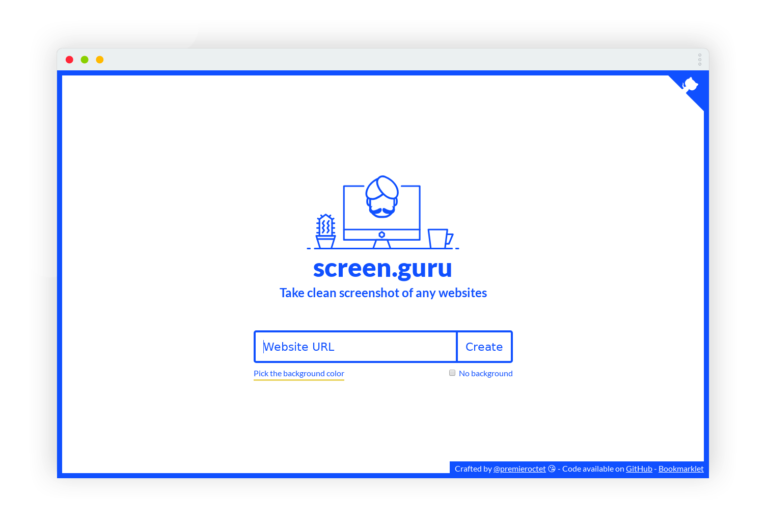
Simply paste in the URL of the webpage you want, choose a background colour or a transparent background, and Screen Guru will generate a nice, clean, high-resolution screengrab that you can download as a PNG file and insert into your presentation or use for a project of your choosing. We’ve used Screen Guru to generate most of the screenshots in this article, for example!
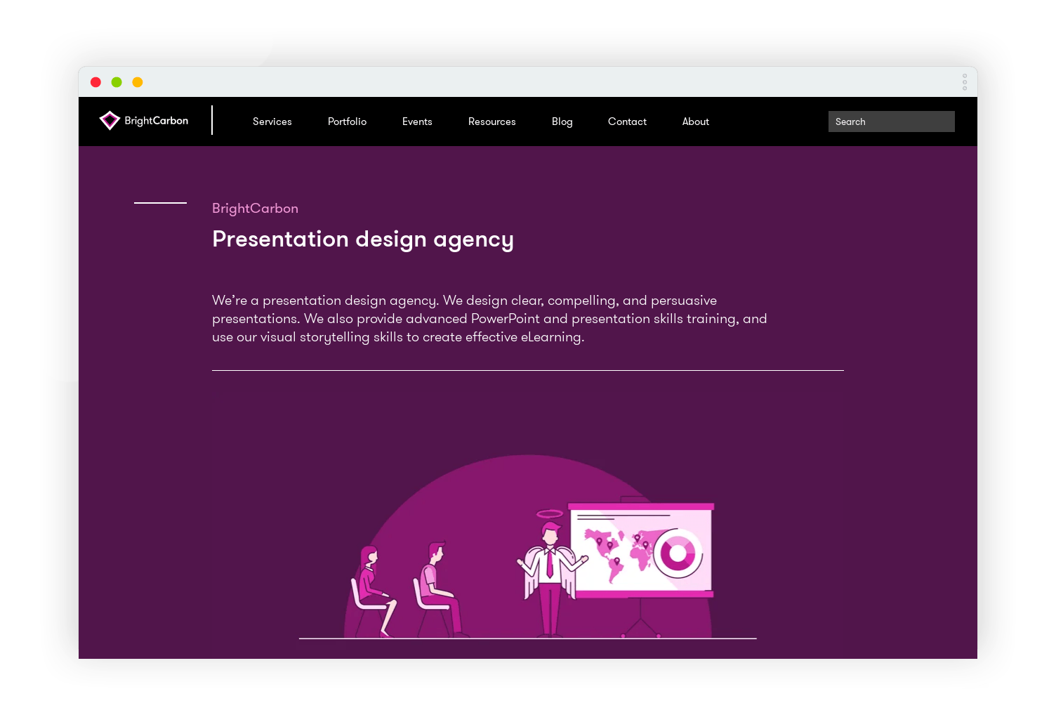
It’s worth noting that some web pages have security settings that mean that Screen Guru can’t create a screenshot, but for a lot of websites it works perfectly well and is a quick and easy solution to the tedious job of creating screenshots for presentations.
Now that you are clued up on where to get some great free design resources, you might be wondering how best to use them on your slides. For more tips and tricks from our mighty design team check out our archive of blog posts on PowerPoint design.
Leave a commentLearn how to automatically generate total values for your graphs and charts using PowerPoint’s Combination Chart option.
February 14th is around the corner, so the BrightCarbon team have crafted three bespoke Valentine's day cards: all built in PowerPoint!
Some presentations require the exact same chart, graphic, or image on multiple slides. A new feature of PowerPoint 2016 is zoom links. With this feature, you can work around the issues of having multiple versions of a graphic throughout a presentation: PowerPoint will do the updating legwork for you! Read on to find how to make the most of this new feature.
Join the BrightCarbon mailing list for monthly invites and resources
Tell me more!We delivered this to over 100 people today, and everyone LOVED the presentation and story. We have received wonderful feedback, and have four opportunities already.
Sarah Walker Softchoice

Thank you very much for this information. This will be sure to come in handy in the future.
Makerbook isn’t going to a live site…FYI.
Thanks CM. Looks like it disappeared about a month ago – what a shame. We’ll update the article shortly.
Wow, What a fantastic plethora of free resources! Just skimming this page has me rethinking the themes of content I’ve created. Possibly time for a fresh facelift!