5 tips for more accessible presentations
More accessible presentation slides can be the difference between your audience fully engaging with your content and your audience tuning out and missing out. And, if your audience miss out you miss out!

One of the most common mistakes we see when it comes to accessibility in presentations is poor color contrast. When there isn’t enough contrast between the colors on your slides, your presentation becomes less accessible to a whole range of people. Luckily, while this is a common error, it’s also a very simple thing to fix. If you are wondering how to determine the best color contrast for PowerPoint, it’s your lucky day! We are releasing a free PowerPoint color contrast checker as part of our brilliant PowerPoint add-in, BrightSlide.
Take me straight to the color contrast checker!
Creating digital content that’s accessible to everyone, regardless of ability or disability is extremely important. It’s estimated about 15% of the world’s population has some form of disability and, with aging populations, this number is rising.
Both the ethical and legal imperatives for accessibility are becoming better understood by businesses, content creators, and designers alike. Many countries have begun implementing laws to ensure commercial websites and apps meet certain requirements for accessibility. More ephemeral content, like PowerPoint presentations, are not explicitly mentioned when we’re discussing accessibility. However, as these media form the backbone of communications, training, sales and much more in many organizations, there’s no excuse to let accessibility standards fall.
Many content creators often – mistakenly – assume that the only people who will benefit from accessible content are those with obvious, permanent disabilities, such as loss of limbs or visual impairment. However, many disabilities are either invisible or poorly understood by non-disabled people. Plus, the knock-on effect of designing with disabled people in mind is that accessible design benefits everyone.
Ensuring that text and other important presentation elements have adequate contrast is one simple thing you can do to improve the accessibility of your presentations. Poor contrast makes text difficult to read, graphs and other diagrams hard to interpret, and makes it much more likely your audience is going to tune out or switch off.

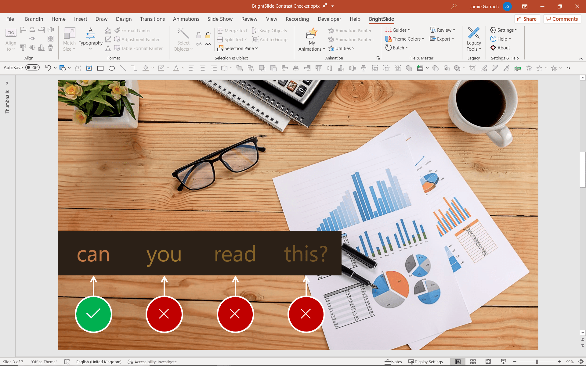
Only the first word on this slide has high enough contrast with the background fill color to be clearly legible.
It’s estimated that approximately 1 in 12 (8%) of men and 1 in 200 women are affected by color vision deficiency (CVD). That’s a lot of your audience you could be excluding due to insufficient color contrast on your PowerPoint slides. But it’s not just people with visual impairments who you need to consider. There are many other scenarios where having good contrast is important:
These are just a few examples to illustrate the importance of getting color contrast right. Legible slides ensure that as much of your audience as possible is getting the information they need, and color contrast is key for legibility.
Color contrast can be complex and depends on many factors. Luckily, you don’t need to understand the science behind it to make a difference.
The Web Content Accessibility Guidelines or (WCAG), are the basis of most web accessibility laws in the world. This makes them are a good place to look if you want to start making your designs more accessible.
The WCAG guidelines are organized into three levels: A, AA, AAA. For most organizations, the objective is to satisfy both level A and level AA guidelines. These deal with the largest and most common barriers for disabled users and are accepted as indicating an organization has a very good commitment to accessibility. According to these levels, there are two key success criteria that you must achieve when it comes to color:
1. Do not use color as the only visual means of conveying information
Your first port of call should be to check that you do not use only color to communicate, at any point in your presentation.
The simplest example of using color alone to communicate, and one we see all the time, is signifying right vs. wrong or positive vs. negative using the colors green and red. Firstly, while these colors are used across the world for things like traffic lights, they are not necessarily universal in their meaning. Secondly, the most common form of color blindness makes it hard to differentiate between green and red. For color blind people, telling the difference between the two circles below is extremely difficult if not impossible.

A simple fix could be to add additional visual cues, for example a tick to represent ‘positive’ and a cross to represent ‘negative’.

For more tips, check out our other article on optimizing presentations for people with color blindness.
2. Ensure slide content has sufficient color contrast
So, the first criterion for success is about not using color alone to convey information. The second criterion is concerned with making sure all the content on the slides is legible.
There is a reason most word processing tools default to black text on a white background, and why we use black ink to fill in forms. For written content to be legible, text needs to have as high a contrast with the background color as possible. In the example below, the text and the background are too similar in terms of color. This means they have a low contrast, and the text is hard to read.

Increasing the contrast between the text and the background could give you something like this:

According to WCAG, for text, a contrast ratio of at least 4.5:1 is required, except for:
If this seems a bit confusing, as a rule of thumb we recommend sticking to a contrast ratio of at least 4.5:1 as a minimum for all text.
It’s also worth remembering that the contrast ratios provided by WCAG are just there as a guide. Font size and weight will affect the contrast and readability of text, so it’s generally best to avoid overly stylized or very thin fonts and avoid trying to cram lots of text on one slide.
There are many color contrast tools and color blindness simulators available online. Unfortunately, most of these require you to manually input the HEX code of the colors you are using, or to upload an image of your text for it to be assessed. This can be time-consuming, especially if you have more than a handful of slides to check. Unfortunately, this inefficient workflow contributes to most people not routinely checking color contrast in their PowerPoint presentations.
That’s why we have added two new color contrast tools to our PowerPoint add-in BrightSlide, enabling you to check color contrast without leaving PowerPoint!
To find out the contrast ratio of text in a filled text box, shape or freeform shape, simply right click. You will see the color contrast checker ratio at the bottom of the menu: remember you’re aiming for a 4.5:1 minimum. Clicking on this ratio will open a color contrast checker pop-up with more detail, showing whether your text passes various WCAG success criteria.

You can use the same method to find the color contrast ratio of the fill color of two shapes. Select both shapes then right click and look at the bottom of the menu.

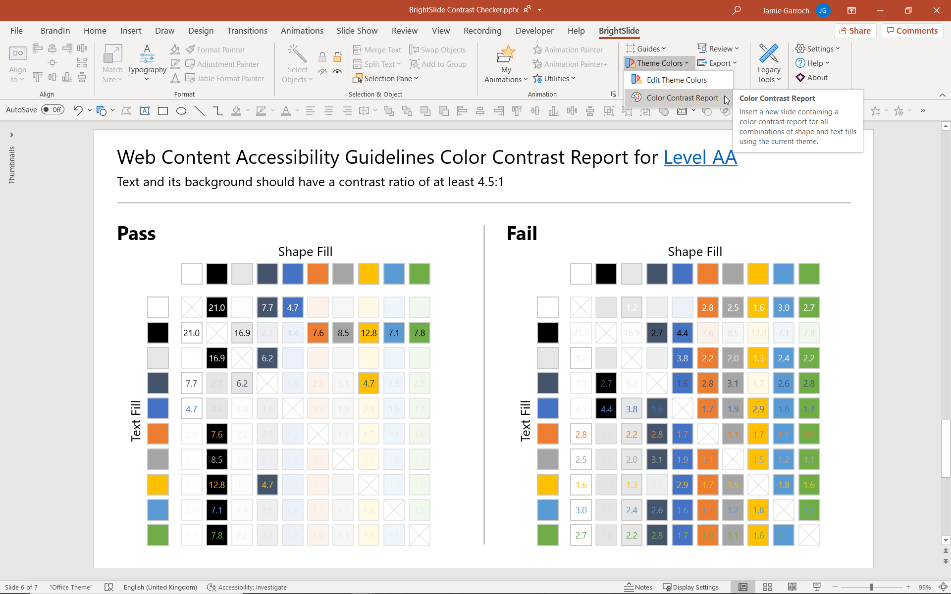
The second exciting new PowerPoint color contrast tool we have developed is the Color Contrast Report, which can be found in the BrightSlide tab under Theme Colors. Clicking on this will generate a report of all the different color combinations of text versus shape fill from your theme colors with their contrast ratios, and whether they pass or fail the 4.5:1 requirement.

This color contrast checker allows you to get an idea of which combinations will work best before you begin designing your presentation. This is extremely useful when you’re setting up the slide master and making decisions about background, shape and text color. Access our free on-demand video about PowerPoint templates and masters.
Now you know why using a color contrast checker is so important, what are you waiting for? Download BrightSlide for free now! If you’re still not convinced, go ahead and read about some of the other incredible productivity and design features it offers PowerPoint users.
Leave a commentMore accessible presentation slides can be the difference between your audience fully engaging with your content and your audience tuning out and missing out. And, if your audience miss out you miss out!
Icons are a fantastic and versatile way of making your presentations more visually engaging. However, icons can also end up being at best decorative or at worse distracting when not used carefully. Learn three tips for choosing the right icons for your presentations.
We’re calling out one of the major injustices of corporate rebrands across the globe – PowerPoint falling to the bottom of the rebranding checklist. We discuss why it's a problem and how to fix it!
Join the BrightCarbon mailing list for monthly invites and resources
Tell me more!Throughout all stages of this project we have had a world class experience. The team was uber-responsive and open to feedback and collaboration to ensure we were getting the best presentation possible.
Marc Chaanine Jamaica Bearings

How is it that the contrast for black text on white says 2:3:1?
a very good tool for ppt design. But my anti-virus software tested virus in it. How can I solve the problem? Thanks.