How to create PowerPoint templates that work
- PowerPoint design
- Comments: 2
Without a proper PowerPoint template, presentations can be a bit of a mess. Here are the building blocks for developing a PowerPoint template that works!

I work with many different people, in different roles, in different organisations, with different objectives. All face the same problem – they need to communicate more effectively. At BrightCarbon, we promote using visuals to help people communicate, with tools that are compelling, clear, and persuasive.
Everyone gets this. They love the idea of it, can see how it works, and appreciate the cognitive psychology that underpins it. And yet, so many people tell me that while they like it, they themselves can’t use a visual approach, as their content is too technical, and so needs the bullet points.
This is absolute, utter, complete, total, and unconditionally rubbish.
There are some cracking examples out there of technical content presented badly, but granted few of them are as bad as this. Still people use examples like this to suggest technical information cannot be presented visually in a way that is engaging (and not confusing) . Inevitably when I hear this, I show people examples of technical content presented visually. I take great pains to show that ‘visual’ does not mean ‘dumbed down’, and does not mean that information has to be lost. It simply means that the same information is presented in a way that makes it easier to understand. Again, everyone nods along, but still the objection remains that while all of the above is true, their slides are somehow different.
This doesn’t just happen with people that I meet through work, or at conferences, but also with my friends and family – yes, I do sometimes have conversations with them about presenting, as everyone has to do it, and nobody likes it.
One of my good friends, Stef, is a medical doctor, and regularly has to present patient case histories to small groups of both senior and junior medical staff in the hospital. The idea is that everyone gets a better understanding of how to treat specific kinds of patients. The information is very technical, very specific and does not lend itself well to a template approach. Stef therefore said that he always had to present using bullet points. I was so bored of hearing this that I told him to get online, send me his slides and spend fifteen minutes looking through his material so that I could prove, once and for all, that he could either agree with me, or be wrong.
This is true, I really did make one of my friends go through this at 20:00 in the evening in the middle of a ‘how are you doing’ catch up call.
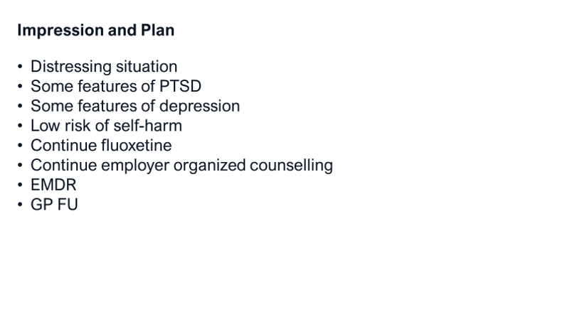
Stef had a set of six slides. They all looked the same. Here is one of them. Looking at it, although there are relatively few words, you can’t really get a sense of what it is trying to say. It took a while for Stef to explain that it contains a description of the patient’s history, considerations that needed to be taken, and the next step actions for the best treatment.

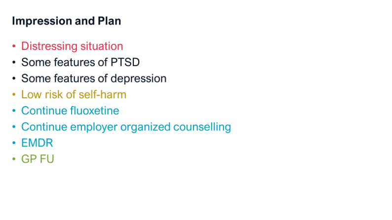
So first things first, cut down the amount of time that it takes people to understand the context of what you are saying, by making that context really obvious, meaning that they can spend more time thinking about what you are actually saying. A really easy way to do this is to group similar points together, either using spatial relationships or colour changes (there are some useful examples of how to do this in our blog post on visual hierarchy). No one can argue that this isn’t easy and that they don’t have time for it, but it gives an entirely new level of information to help the audience understand.

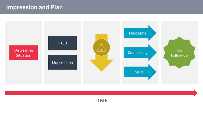
Next, I said that we could start to form a basic diagram using three approaches:
1. Each of these groups of actions occurs in order, so if we draw a timeline and show the five sections along it, we’re helping the audience more easily understand the sequence.
2. Using really simple animations to make the information appear in small, bite-sized pieces, means that we can help the audience more easily follow the sequence, and benefit from the presenter’s relevant explanation of each point in turn.
3. If we start to use some really simple visual devices, such as warning triangles and arrows to help indicate the meaning of the term in question and reduce some of the text we can focus the audience on the most relevant information and help them better understand it. All three of these actions are easy, simple and quick to do.

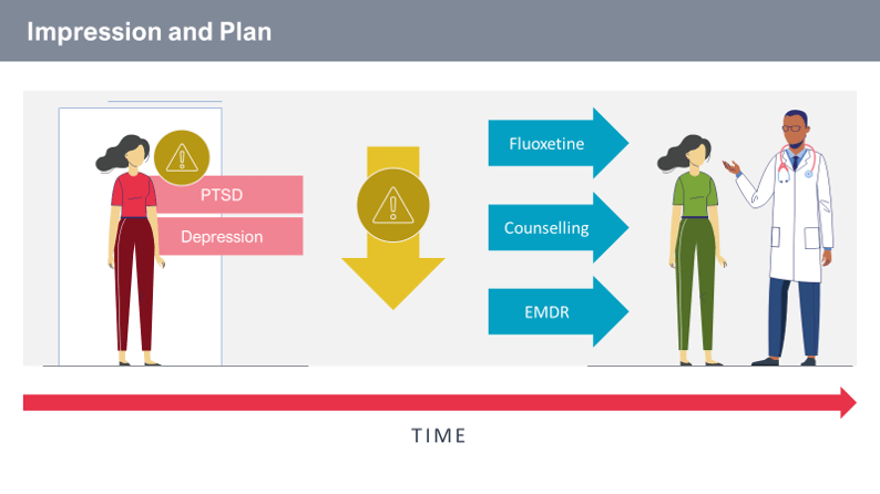
4. The final step is, I admit, a little more complex, and if you don’t take it up, then fine – your presentations will still be a lot better. We started using a few more visuals to replace text, using colour to show meaning, and more complex (although still easy to do) animations, to make the content as easy as possible to understand.

The end result is that far from simplifying information, we are still communicating exactly the same thing, but just in a way that makes it easy for the audience to assimilate and understand it. The results speak for themselves – his audience not only loved his session, but it also generated an excellent discussion about the scenario across the team, leading to more insight, and a better awareness of how to best handle this type of patient in the future. Try it yourself to see the impact that it can have on your next meeting.
Leave a commentWithout a proper PowerPoint template, presentations can be a bit of a mess. Here are the building blocks for developing a PowerPoint template that works!
By applying some key principles of presentation design, you can make your PowerPoint design really standout and deliver both a more ‘popping’, but also more effective presentation.
Most presentations are a cascade of text-heavy Death-by-PowerPoint slides. Online learners suffer the torture of brochures converted to click-through-eLearning. Most people now recognize that using visuals is the way to go. But how do you make visual presentations and eLearning that work? We think there are six steps you need to follow.
Join the BrightCarbon mailing list for monthly invites and resources
Tell me more!The launch was a success! Thank you so much for delivering even against the extreme turnaround time.
Mila Johnson InComm

This is very helpful.
Thanks!
You’re welcome Michael, and that that it’s been able to help. Now go out and change all of your future presentations!
Thanks for going through thsi in steps it raelly makes it clear how to change
It’s definitely a good way to start, going through it step by step. Once you get more comfortable with it, you’ll find that it all happens at once, becoming smoother and quicker. Good luck with all of the beautifully visualized presentations.