Trade show booth ideas you can make in PowerPoint
How can you quickly create on-brand, polished materials for your next event? Here are 3 trade show booth ideas you can make in PowerPoint.

Today we’re calling out one of the major injustices of corporate rebrands across the globe – PowerPoint falling to the bottom of the rebranding checklist!
Your rebranding checklist is long and complicated and your priorities are pushed and pulled by too many stakeholders. But, as a presentation agency, we see the consequences of forgetting about PowerPoint all the time. The new PowerPoint templates have (usually!) the right colours and (sometimes!) the right fonts. They often look pretty darn good, but when they’re released into the wild things don’t go well. Often the template isn’t robust enough to meet the needs of hundreds or thousands of employees, add to that a lack of adoption and the people that ‘always preferred the old brand colours anyway’ and you have a disaster on your hands.
The problem is that so much of corporate communication, from team meetings to sales pitches, is developed in PowerPoint. Meaning that even though your website looks great and your flyers are beautiful, the PowerPoint presentations put in front of clients, prospects and industry peers let the side down. With poorly set up layouts, and an organisation of employees who don’t know how to use the template properly, you end up with old brand, no brand, and new brand coexisting like Cinderella and the ugly sisters. And like poor Cinderella, the ugly siblings can dominate, undermining your beautiful new brand.
But do not fear. Your fairy godmother is here in the form of PowerPoint experts and creators of effective presentations, BrightCarbon. And usually this is where we’d say that unfortunately we can’t fix everything with a wave of a magic wand but actually, in this case, we can!
But before we get to the magic wand – here are a few tips on setting up your new PowerPoint template for success when you’re rebranding.
1. Know what makes a good PowerPoint template
The first step to making a good PowerPoint template is to know what makes a good PowerPoint template. Dazzling insight, I know! The thing is, many brilliant designers, and internal creative agencies know lots about websites, or social media, or print, but don’t actually know much about the nuts and bolts of PowerPoint. This leads to things like using hefty images in the Master layouts, deleting core layouts, deleting placeholders – and if you’re not sure why any of this is a problem then you may need our help!
Fortunately, we’ve written a detailed blog post on how to create PowerPoint templates that will walk you through the process step-by-step.
2. Map your layouts
One of the biggest problems organizations face when moving from one PowerPoint template to another is employees pasting old content into new decks. It’s inevitable but it can add extra layouts into the new template, causing file bloat. You’re then also stuck with slides that don’t align to the new PowerPoint template – with your old logo or the slide numbers in the wrong place. One way you can guard against this (though this method isn’t infallible) is by mapping the new layouts to the old.
PowerPoint will use slide masters to map your content and, hopefully, update everything to match the formatting and placements set up in your new template. There are two factors PowerPoint takes into account when moving content between templates. If you understand them, you can prepare your slides as part of the rebranding checklist to make the transition easier.
Each slide in a template has a name, you can see it by selecting a slide, then Layout in the drop down menu.
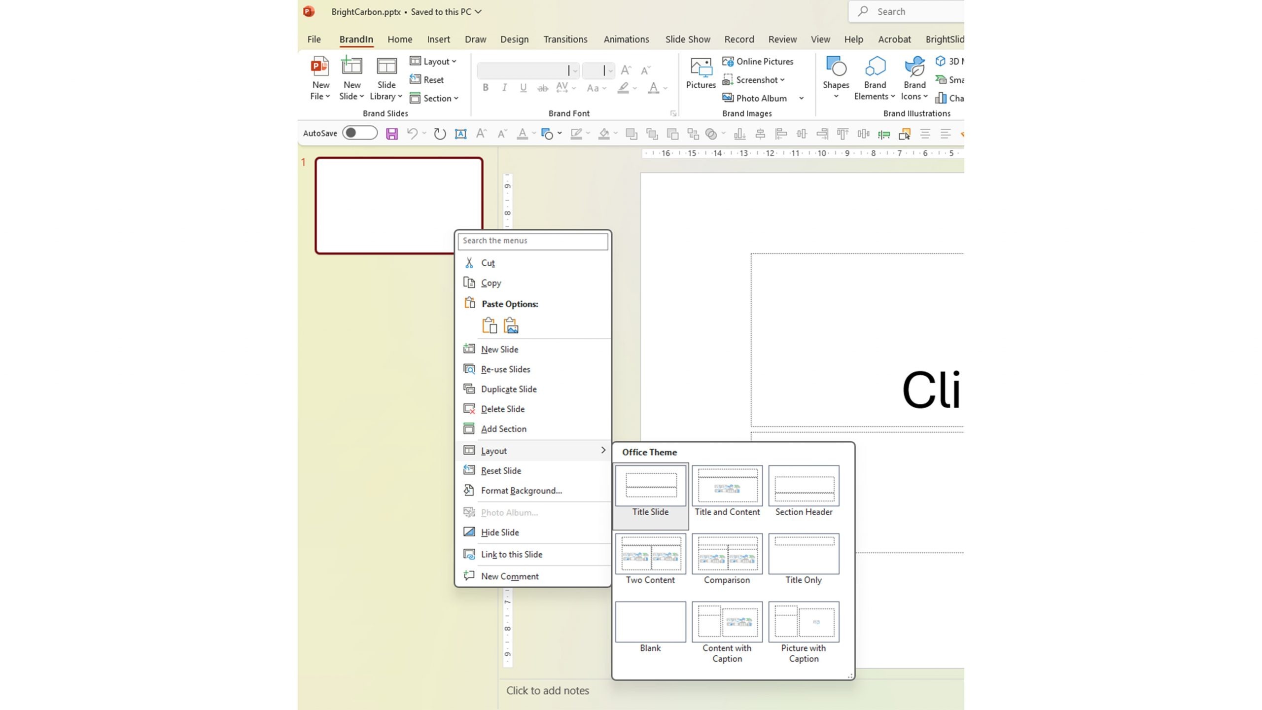
If, for example, you copy a slide on a layout called ‘Agenda’ and paste it into a new template which already has a layout called ‘Agenda’ then your content will map to the layout in your destination deck and the slide will take on the new formatting. 
If PowerPoint thinks that there isn’t a matching layout then it will create a new layout in the slide master.
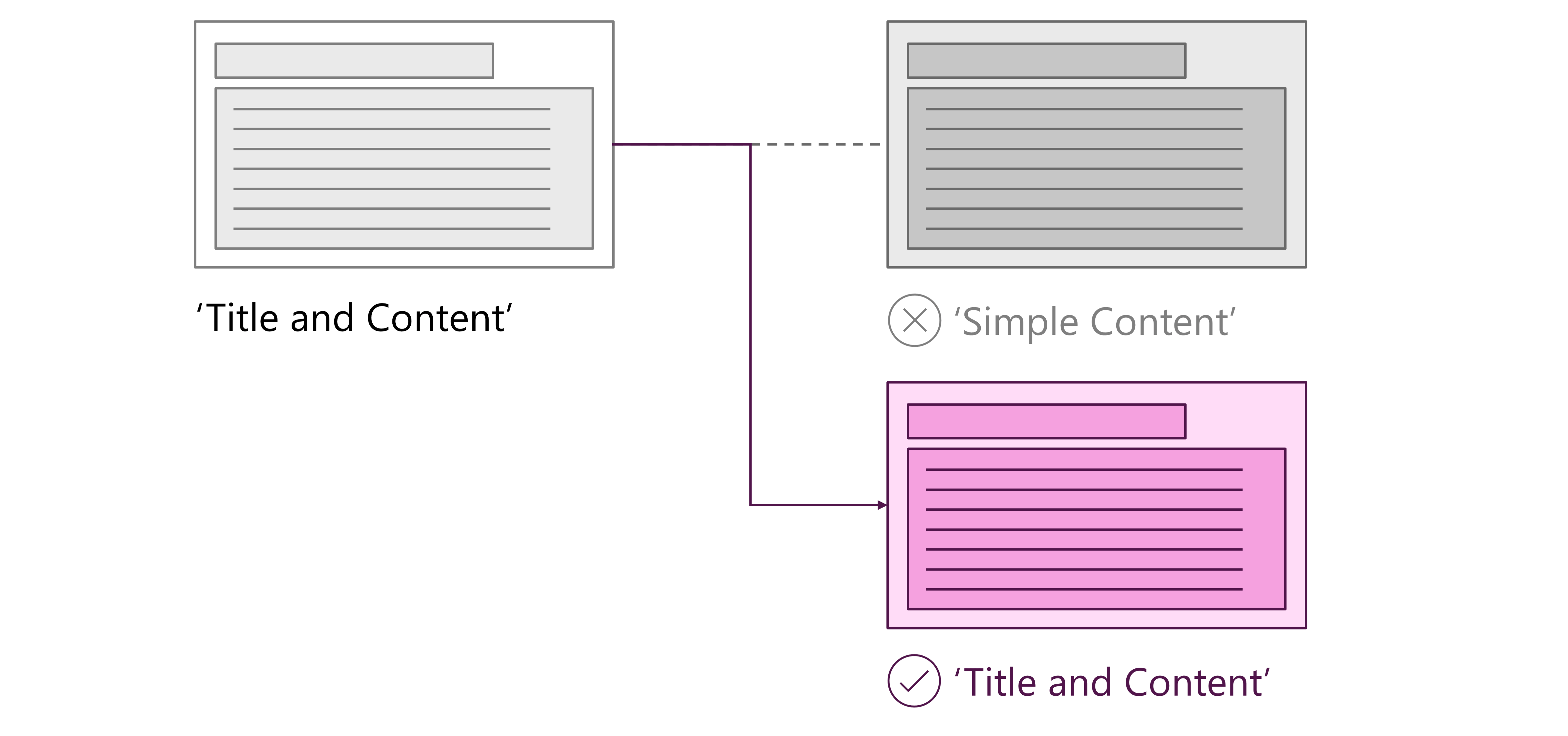
Except….it’s not quite that simple!
If the layout in the new template does have the same number and type of placeholders as the old template, then the content will map as expected. If it doesn’t – even if the layouts are named the same – PowerPoint will create a new master layout.
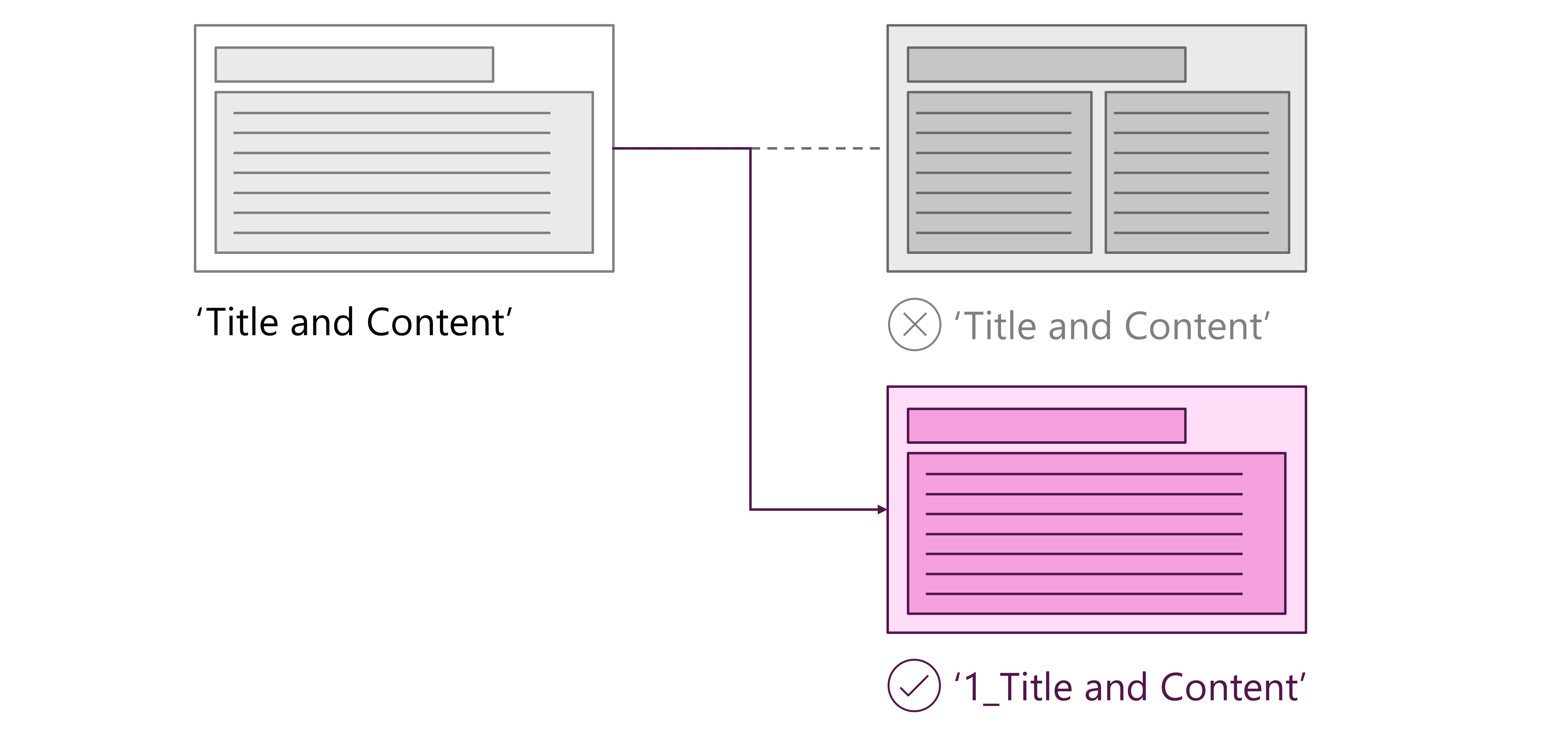
You don’t want this to happen as your slide masters may become bloated with slide layouts making your files much bigger than they need to be. On top of that, PowerPoint doesn’t always do the best job of formatting the new layouts. So how do you make sure PowerPoint mapping works (as much as possible)? When you open a new PowerPoint file, the standard layouts available are: Title Slide, Title and Content, Section Header, Two Content, Comparison, Title Only, Blank, Content with Caption, Picture with Caption. These are what we refer to as the ‘core layouts’. If you have East Asian languages installed you may see two additional layouts. All template projects should build on these core layouts, and the default placeholders on these slides should only be adapted by changing the formatting or styling. Do not delete, duplicate or change the name of any of these layouts. This way, if any of these layouts are pasted in from an older template then they should automatically snap to the corresponding new ones. If you need any additional layouts you can use Insert Layout in the Slide Master, and add placeholders as needed. Remember to keep things simple and try not to add any template layouts that are too complex. These are usually better suited to a toolkit slide (see below), built on a ‘Title Only’ layout.
3. Map your colours
This is a similar idea to mapping slides. When you paste old slides in to a new template, the colours change to those in the new template. Make sense, right? But what if this happens?

Nightmare – you have an unusable slide and it’s likely that the user will simply keep the old colours rather than trying to fix the new version. So how can you prevent this? When adding your brand palette to a new PowerPoint template, knowing how theme colours populate a deck will save you time later on and increase the template’s usability.
This is how PowerPoint theme colours work.
There are twelve colours in a theme:
Now you know how the colours will be used, when you’re developing your new template you need to map the old colours to the new and try to ensure that when old Text 1 goes to new Text 1 the slides will still work.
4. Avoid image-based layouts
Something we see really frequently is PowerPoint designs built in other programs, like the Adobe suite, then added to PowerPoint masters as images. It’s understandable, if you’re most comfortable designing outside of PowerPoint, and can look good but can quickly become really difficult to work with.
Reasons to avoid:
It’s really worth building time into your rebranding checklist to translate those gorgeous new designs into PowerPoint via PowerPoint shapes and vectors.
5. Create a toolkit
Another common mistake we see is really long templates stuffed with slide layouts, graph and charts, images and more. These files are difficult to work in and hard to share. Ideally, your template will be light – 2-3MB tops – but there is often a need for extra graphics and sample slides. Instead of expecting your template to do everything, add creating a toolkit to your rebranding checklist.
What’s in a toolkit?
It depends on the type of content your users are creating but common assets are:
Make it easy for people to create the slide they use most. Do some research by reviewing a representative sample of presentations; maybe people hardly ever use graphs in your organisation (lucky them!) but they do use mobile phone screenshots all the time, or timelines, or processes. The point of a toolkit is to equip people with all the stuff they need to make it easy for them to choose the new design style over their old slides.
6. Include instructions
There are a couple of key places to include instructions. At the end of your template add a slide saying – essentially – ‘this is the end of the template’ to show users that any layouts after this are not part of the official template. When PowerPoint creates those new layouts we mentioned earlier, it puts them at the end of the template so this is an easy way to prevent your template becoming corrupted.
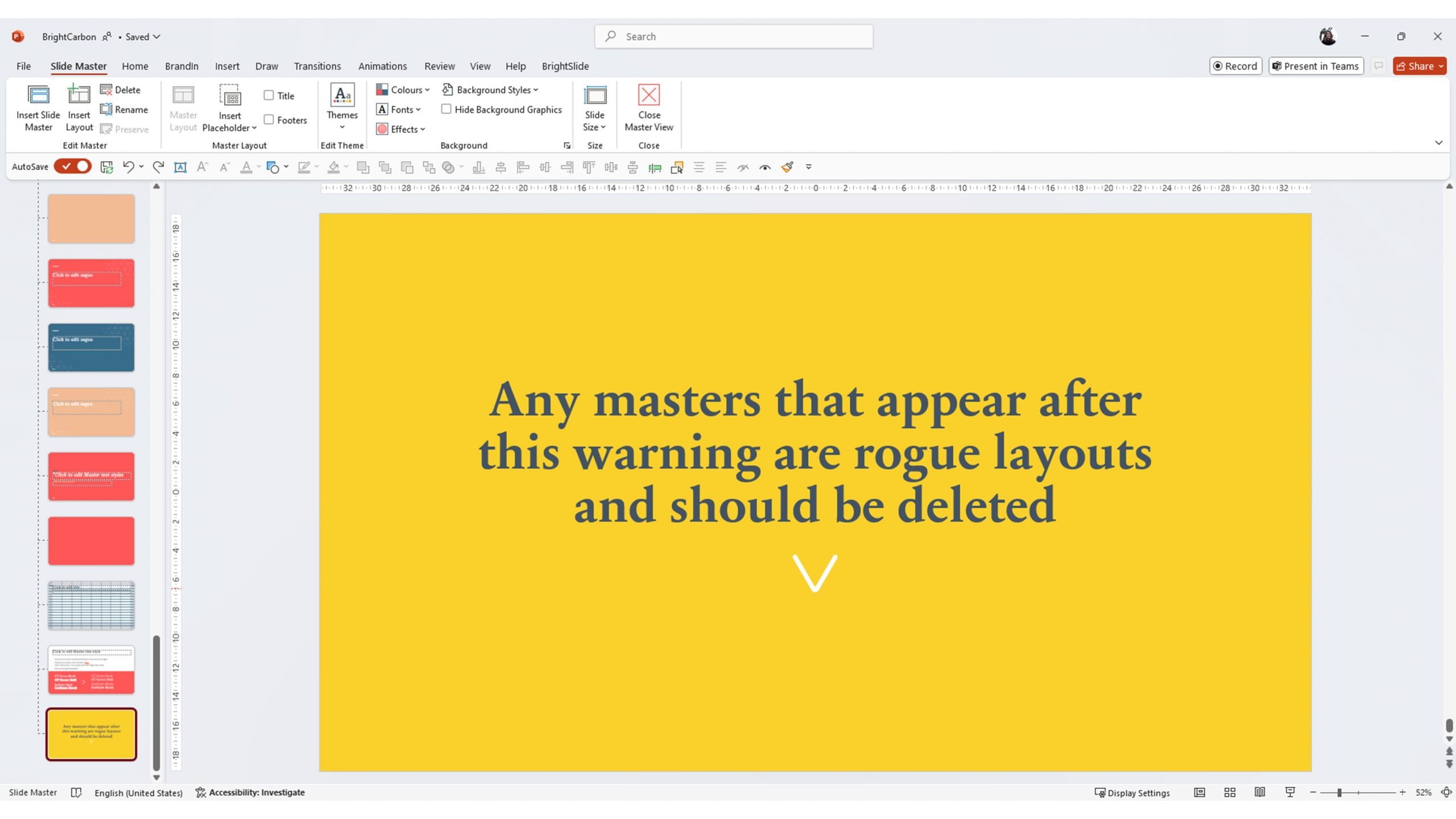
In the toolkit, you can provide more detailed instructions on how to use the template and the assets you’ve provided, what to avoid, how to change colours and images etc.
Okay. So all the advice for your rebranding checklist is great and does work. But it’s also a lot of work. And people generally have better things to do than pour over PowerPoint presentations all day fixing font issues. That’s what got us into this mess in the first place. After years of seeing this play out with our clients again and again we decided to develop a solution that automates a lot of the manual tasks that go into making a deck brand compliant.
Our solution, BrandIn provides everything users across your organisation need to create brand compliant content in your new template. Here’s just a few things it can do.
Easy deployment and updates: Normally, IT departments deploy templates across the organization, but for many it’s a painful, lengthy process. BrandIn shifts the power from IT to the marketing team. It makes it super easy to add, edit and recall templates whenever necessary whether it’s for a full rebrand, updating the year in the footer on Jan 1st, or adding a temporary template for a one off event.
Library of brand assets: If you’ve had enough of users finding unlicensed images online and ignoring your brand library, BrandIn can fix that. It brings a library of your brand assets (including icons, images, and illustrations) right into PowerPoint making it easier to stay on brand than stray off the path.
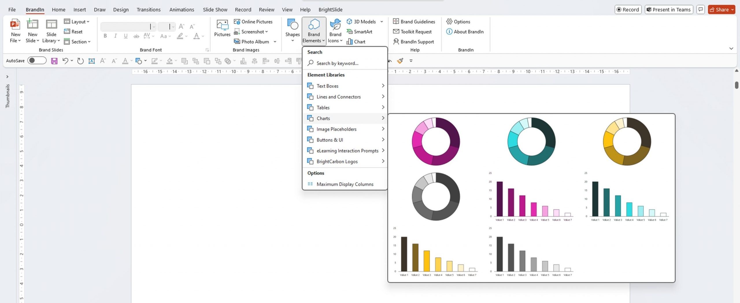
Customizable brand checking: When you roll out a new template, people either waste their precious time struggling to make slides brand compliant or, even worse, they don’t! BrandIn comes with brand check. With the click of a button BrandIn checks and fixes slides with common mistakes like the wrong fonts or colours, brand names without legal marks, off brand formatting on shapes… The list could go on and on – it’s up to you!
Reducing errors and file bloat associated with content migration: One big problem with implementing a rebrand is that users have to move all their content over to the new template. This can bring a bunch of issues as we’ve already seen, including wrong layouts, wrong colours, and adding extra layouts to a template – increasing the file size. We’ve developed the BrandIn Smart paste tool to allow us to tell PowerPoint what to do in terms of layouts, shapes, colours, fonts and more so pasting slides onto new template works. Multiply that over thousands of presentations and you’ve solved a massive problem.
We could go on listing BrandIn features, it’s modular and highly configurable so you can chose what you need to best match the way your organisation works, but we won’t in case we’re accused of blowing our own trumpet too loudly! You can see the full list of features here.
If you’ve heard enough and want to learn how BrandIn could tick PowerPoint off your rebranding checklist for good get in touch with us for a chat and demo.
Unlike Cinderella, this magic won’t disappear at midnight!
Leave a comment
How can you quickly create on-brand, polished materials for your next event? Here are 3 trade show booth ideas you can make in PowerPoint.
A PowerPoint template is the foundation on which polished and professional presentations are built. We interview BrightCarbon’s new Templates Lead, Gemma Leamy, and pick her brains on the ideal process for creating robust PowerPoint templates.
Here are five things you should commit to doing this year powered by our productivity and design PowerPoint add-in BrightSlide!
Join the BrightCarbon mailing list for monthly invites and resources
Tell me more!BrightCarbon creates compelling visuals and storylines, helping us to convey value in a fiercely competitive marketplace.
Neil Davidson Deltek
