Publisher is dead. Long live PowerPoint!
- Industry insights
- Comments: 4
Microsoft announced that Publisher is leaving us in October 2026. Read on for nostalgic Publisher memories and three great alternatives to explore before the Big Switch Off.

As I’m sure most of you eLearning folks will know, it’s not always possible to use expensive eLearning programs. And when you do, they often require an extensive grasp of the software just to make tiny tweaks. I’ve been asked countless times if I can create an eLearning using PowerPoint that really feels like an eLearning; using interactivity, quizzes, and role-plays. I’ve got by by creating interactions using PowerPoint animations and triggers but as the complexity of the interactions increase, this can become laborious and headache-inducing! And I’ve never been able to offer a solution in PowerPoint that tracks results. Well, today I’m reviewing iSpring Suite 10, a PowerPoint extension that claims it helps people create eLearning in record time.
iSpring Suite 10 is a PowerPoint-based toolkit. Once installed, an iSpring Suite 10 tab appears in the top ribbon in PowerPoint, meaning you can design and animate your content using all of PowerPoint’s great features then add in lovely interactive elements using iSpring. A match made in heaven some might say! To top it all off, there are a few hidden delights that come in handy for a variety of purposes.
iSpring currently have an offer where you can trial the software for free for 30 days (no card details required!). If you get the iSpring bug after having a play, you can presently purchase the full iSpring Suite Max for one author for £719.*
System requirements: Microsoft Office 2007, 2010, 2013, 2016, 2019, Office 365, For Windows 10/8/7, 32- and 64-bit.
The iSpring tab is very user friendly and easy to navigate. The UI matches PowerPoint’s interface, so you don’t have to get used to a new format. Starting from the left, you’ve got the ability to record narration and video directly within the program while previewing the slides. You’re also able to manage your recording. The Manage Narration tool is super handy as it gives you the ability to trim down the audio and make basic improvements to its quality.

My favourite thing has to be the ability to see the audio waves visually on a timeline. It may not sound like much, but it allows you to add markers and seamlessly time animation to match the narration, without the frustration of timing and retiming the markers.
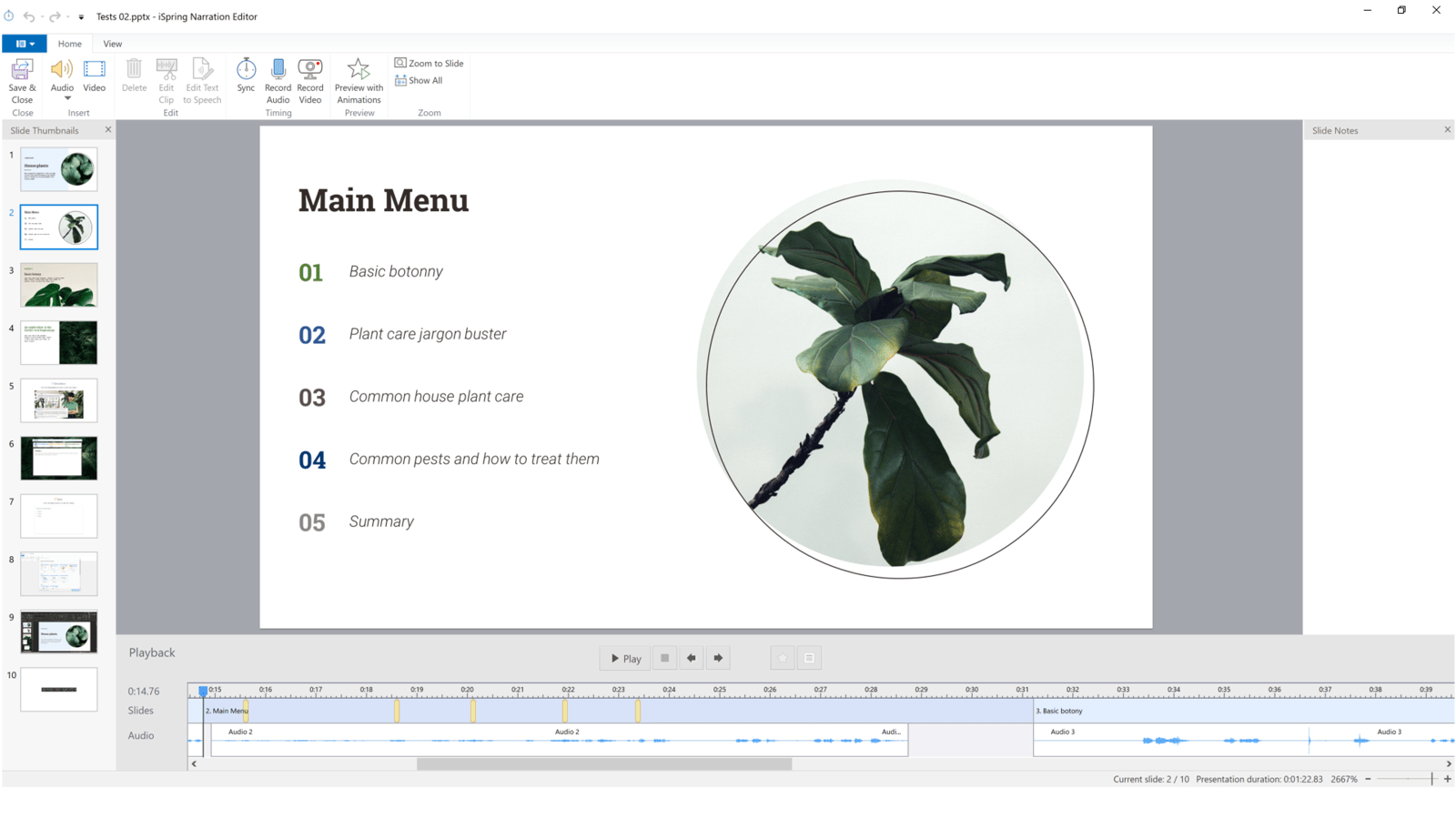
While you can do this within PowerPoint itself, iSpring have improved on this functionality by making it more visual, saving you time when syncing complex animations to audio. Time you can use to watch some Netflix, listen to a podcast, or check out some of our free masterclass events perhaps? Whatever floats your boat!
Interactions

Okay, now it’s what you’ve all been waiting for, the interactions! iSpring comes with an array of pre-made options to help you create eLearning content quicker than you can say ‘the cats pyjama’s’.**
Interactions can inform a user’s learning journey, cementing the information you want to convey by involving the learner. Now I love to get creative with triggers and hyperlinks in PowerPoint, as I mentioned before. And, I have spent hours building some pretty complex trigger systems, pushing what I can do (or have the will to do!) within PowerPoint that will enhance a learner’s experience. iSpring cuts out the hassle of creating interactions manually by providing a whole heap of pre-made interactions, so you’re bound to find what you need.
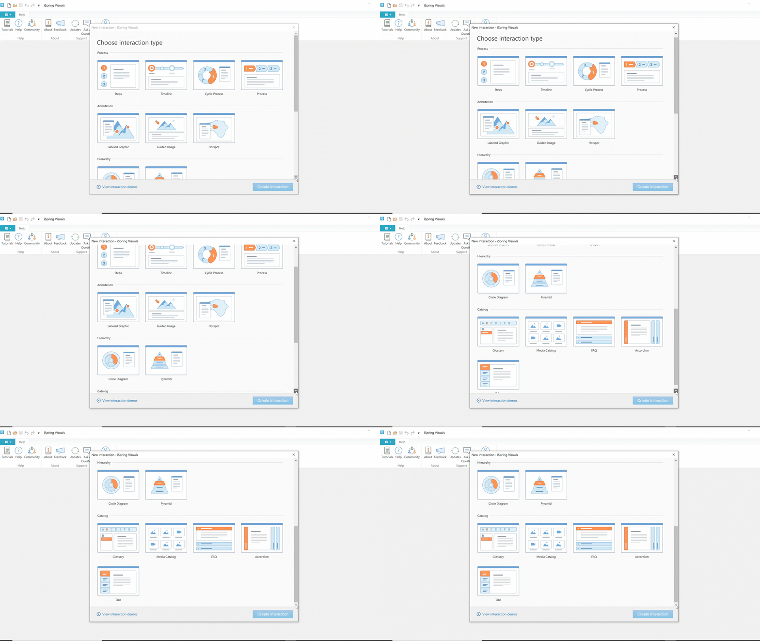
Once you’ve found the interaction, you can simply enter your content into the Interaction Builder, format the text, add in imagery to match, and voila, a lovely interaction ready for your learners.
Dialogue Simulator
Another great way of adding to the learning journey is simulating dialogue. A simulation enables you to take a learner through a variety of circumstances and have them navigate their way through a conversation, teaching the learner the appropriate way of handling different situations. iSpring have created a way to quickly and easily simulate conversation using a simple drag and drop method to link up responses. Gone are the days of having to manually create hyperlinks, triggers, and buttons!
When you first open up the Dialogue Simulator it can feel a little imposing. However, the way it’s been designed (and iSpring’s top notch help videos) mean you can quickly pick up how to effectively use it.
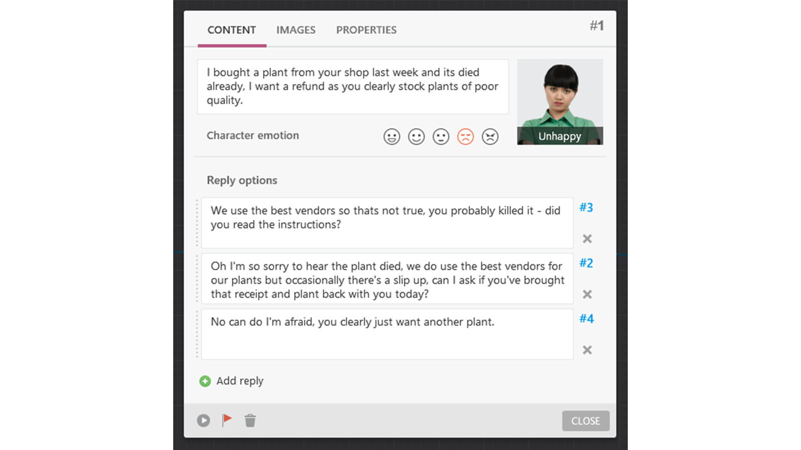
You start by creating a new scene and entering the question and responses. You can then choose from the huge content library of characters and backgrounds to add life to your simulation. You can also pick which emotion you’d like the character to display. Once that’s all filled in and closed, your scene will be added onto the workspace. Then you just have to drag and drop the responses and iSpring will automatically create a new scene for you.
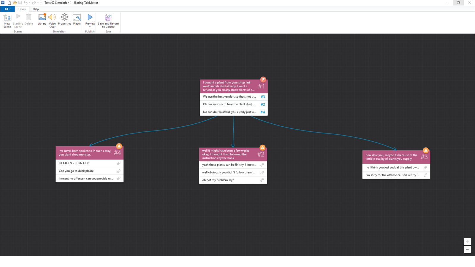
Now obviously this example is super simple. However, you can create as complex a simulation as you like. There are endless opportunities for engaging your learners with the Dialogue Simulator, the only limit is your imagination.
Quizzes
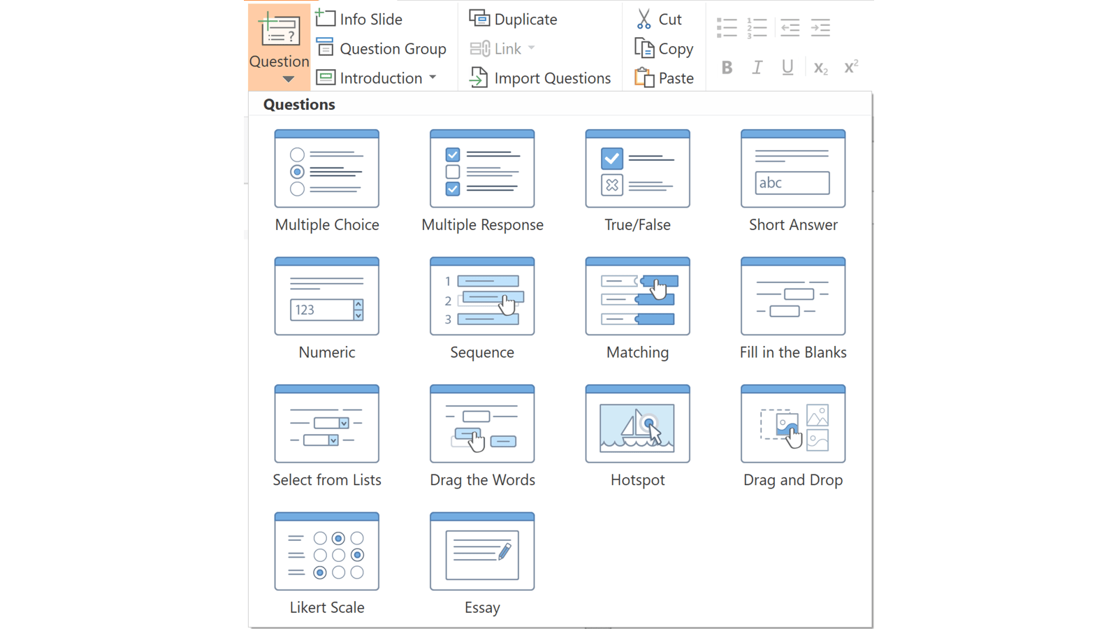
Now you’ve created some super informative interactions that add value to the learning journey, you may want to test your learners by quizzing them. iSpring makes creating quizzes super easy, giving you the choice of either graded or ungraded quizzes and surveys. Once you’ve selected what you’d like to create, the QuizMaker opens up into form view. From here you can select from a variety of quiz questions, then simply input your content and iSpring will do the rest.
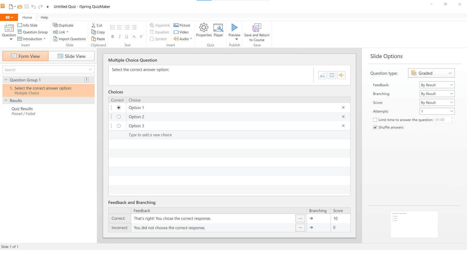
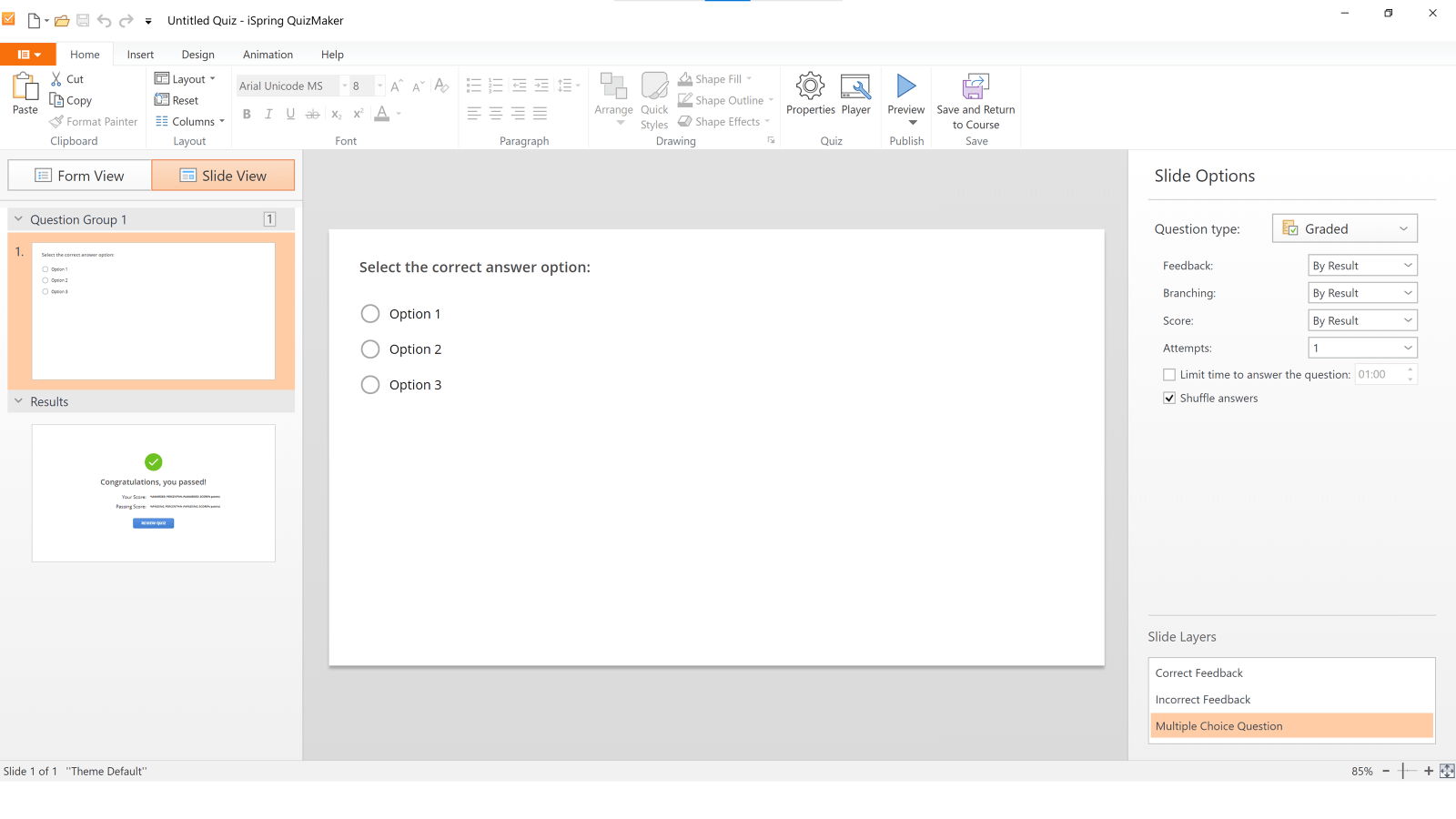
When creating your quiz, you can view the content either in form or slide view, both are very handy for different purposes. Form view is an easy way to input your content, select which answer is the correct answer and input feedback. Slide view is where you can get into the nitty gritty and design the quiz. You can change fonts, pop in some images or shapes, and add simple animation.
Other useful tools
Not only does iSpring help with interactivity, but the suite also comes with a huge content library of slide templates, characters, images, and icons. There’s something in there for every project.

The templates really are a gift if you struggle with designing your content. Once you’ve selected a template, iSpring pulls through all the layouts into the PowerPoint master, meaning you can easily select which layout works best for your content from the layout dropdown on the Home tab. You can then add in text and images into the placeholders and have a beautifully designed slide in minutes.
There are around 30,000 characters and hundreds of backgrounds, objects and icons that are easily accessed all within the iSpring tab, saving you from trawling through stock image sites. The characters come with a full range of emotions (up to 400 each – who knew there were so many!), the icons are built using PowerPoint shapes so you can edit them to your heart’s content and there’s so much choice of backgrounds and objects, you’ll be sure to find something that works for your project. The content library works hand in hand with the other tools iSpring offers, again, cutting down on time and effort. What more could you want?
Presentation controls and publishing

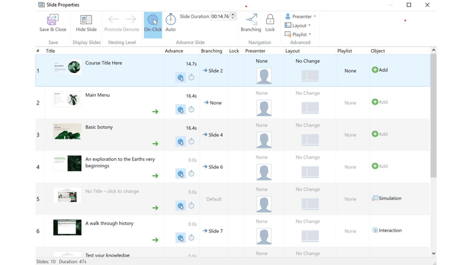
So, you’ve finished designing and entering content into your wonderful eLearning. Now it’s time to finalise the settings and export it. iSpring makes this process (you guessed it) very easy! Opening up Slide Properties, you’ll find an overview of the slides you’ve created – you can set timings and chose how the slide advance, set up branching, add in audio and decide how you want the player to look for each and every slide. You can also add in further objects directly through the panel, so if you feel a slide is missing an interaction, you can click on Object to create a new one. Bish bash bosh, done!
In Presentation Resources you have a heap of options to enhance the learning experience further. You can upload relevant documents for learners to download, these documents will appear in the Resource’s dropdown in the player. You can also enter presenter information via a handy form, including photos and logos specific to each presenter, and you can personalise the player by adding your company logo.
Speaking of personalising the player, in Player Settings you have a lots of ways to do just that. And if you’re anything like me, it’s also quite fun! In the Layout section of this pop up, iSpring gives you various possibilities of where to place the features within the player, meaning you can totally change how it looks to fit with your eLearning. If you aren’t sure about how to lay out the player, iSpring provides some handy templates to work with. In the Colour tab you can change the colour of each asset in the player, giving you the ability to make it as beautiful as your company’s brand.
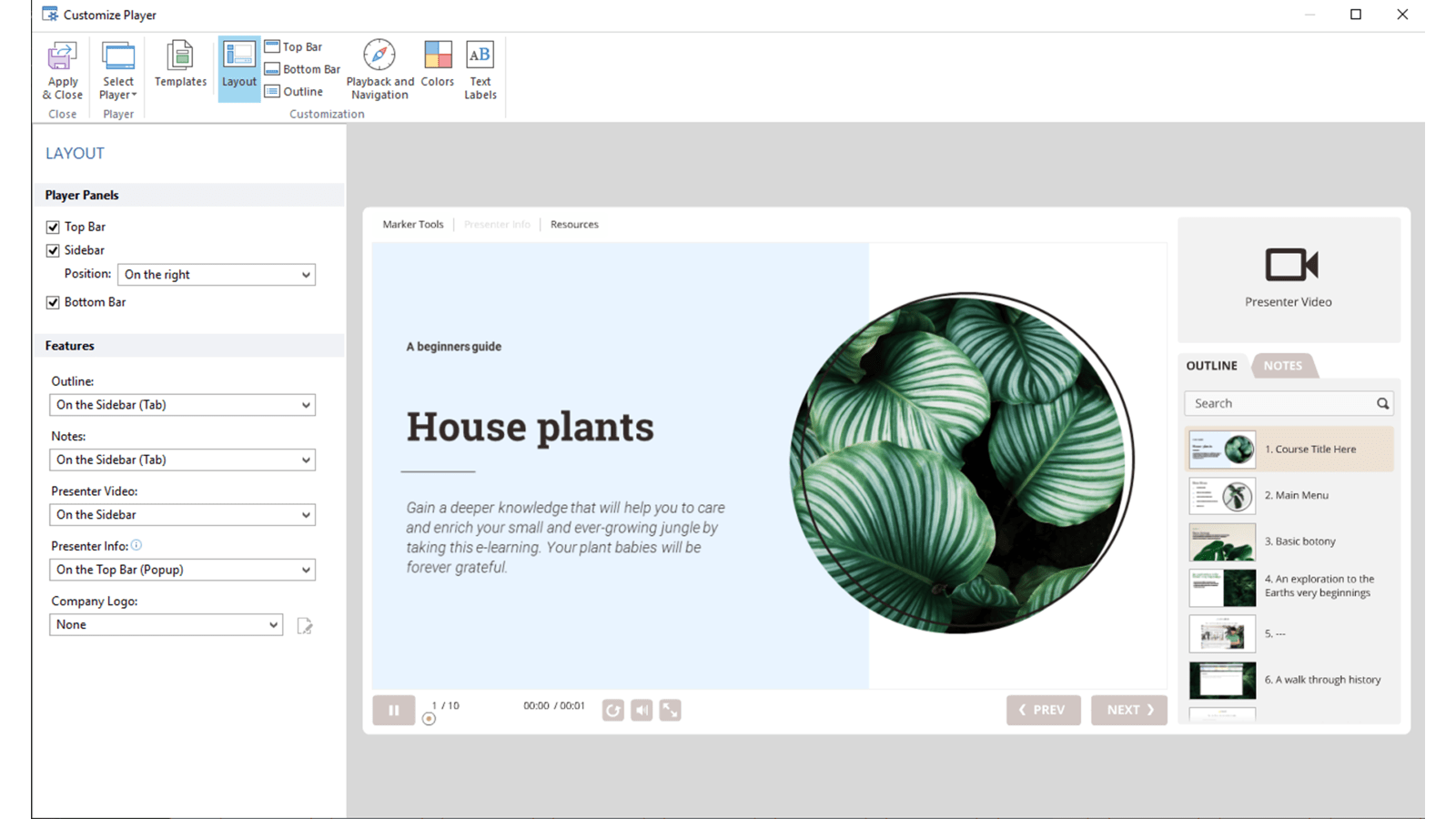
iSpring enables you to preview your eLearning on a range of different device sizes prior to exporting, ensuring that what you’ve created will work well wherever your learners access it. Preview is really handy and will save you from exporting multiple times if you realise you’ve missed anything.
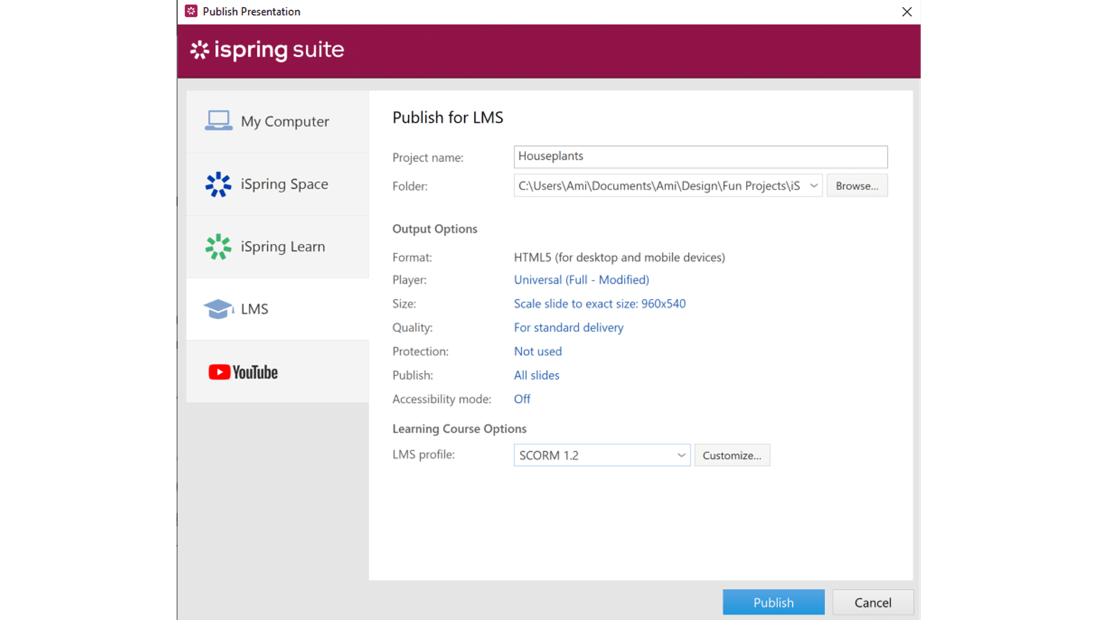
And, finally, you’re set to publish. iSpring makes this a doddle by giving you lots of options to export your eLearning as you can see above. You get similar options for each of the tabs on the left-hand side ensuring your eLearning fits your needs exactly. Having the flexibility of multiple ways to export is great – plus, you can share the project with stakeholders via the iSpring space meaning the feedback process is a smooth one.
Okay, I’ve outline the best of what iSpring has to offer, but it‘s not without fault. So, where could iSpring be improved I hear you ask?! Well, while iSpring does make life easier in some ways, there is still room for improvement.
While you can be fairly flexible with the design of your inputted content, the actual elements provided by iSpring for the interactions aren’t as editable as I’d like. You can change colours of the elements and alter the wording but that’s about it. The actual design has to stay the same. It would be great if there was more choice over how these elements looked and felt, giving you the ability to create something truly bespoke.
Another gripe is that you can’t create colour themes that are accessible across the entire platform. You have to create them separately, for each and every interaction or quiz you make. Having the ability to set and save colour themes that you could access across interactions would save heaps of time. The same could be said with fonts, once again, you have to set the fonts for each interaction. This might not sound like a big deal, but when you’re creating an 80-slide eLearning these kinds of repetitive tasks get annoying. What would be really handy is if iSpring pulled through your PowerPoint colour theme automatically.
My workaround is screenshotting my palette and using iSpring’s colour picker, which luckily works well. I use this to select the colours I’d like to bring through for whatever interactions I’m designing.
As I said before, you have a great content library of icons within the iSpring tab. However, what lets this feature down for me is that you’re unable to add the icons as vectors into your interactions and quizzes. While you can use vectors within PowerPoint, giving you lovely crisp and clean graphics, when copied over to the interaction builders the icons become low quality image files. We here at BrightCarbon are big on visuals (the less text the better), so not being able to use high quality icons within these interactions is a shame.
To get around it you could save your icon out as an image file. However, when saving as an image through PowerPoint, you don’t get the option for image size or quality, meaning it could save out all blurry and not at all what you want. You would need to use an expensive program like Adobe Illustrator to save the vectors out, upping the quality and size, and then add them back into your interactions. Which, let’s be honest, is a bit of a faff.
After exploring and working within iSpring for a few months, I’ve had the time to really get to grips with the toolkit. There are many positives and the fact that you can create something so interactive within PowerPoint without having to manually build each interaction is amazing for people who may not be as au fait with PowerPoint as our designers. For those without years of design experience who need to create quick, effective eLearning, iSpring is ideal. It gives the ability to create professional eLearnings that work really well. As I mentioned earlier in the review, iSpring could be too limiting for people wanting to create something a little more bespoke. However, if the team at iSpring iron out the kinks I mentioned earlier, then I think it would be a great all-round tool!
*Pricing correct at time of publishing.
**This may be an exaggeration.
Leave a commentMicrosoft announced that Publisher is leaving us in October 2026. Read on for nostalgic Publisher memories and three great alternatives to explore before the Big Switch Off.
Best known by some for our persuasive presentations, the brilliant BrightCarbon team also excel in effective eLearning. And alliteration! Our skills developing eLearning that works are called on more often than our talent with literary devices, so I was excited to sit down with BrightCarbon’s eLearning development lead Kelly Atkins. We discuss our eLearning process, common client challenges and cake – enjoy!
A PowerPoint template is the foundation on which polished and professional presentations are built. We interview BrightCarbon’s new Templates Lead, Gemma Leamy, and pick her brains on the ideal process for creating robust PowerPoint templates.
Join the BrightCarbon mailing list for monthly invites and resources
Tell me more!This is awesome! You guys are great to work with and we will absolutely recommend you to others.
John Capuano Lone Beacon
