How to create PowerPoint templates that work
- PowerPoint design
- Comments: 2
Without a proper PowerPoint template, presentations can be a bit of a mess. Here are the building blocks for developing a PowerPoint template that works!

Welcome to the playground of my imagination! In this post we look at the mind-bending world of Morph and how to use it create stunning design effects in PowerPoint. Morph is a bit of a superhero really. Saving you from all sorts of time-consuming activities and other perils.
But what is morph? I’ve been banging on about it and not actually introduced it. The new morph transition in PowerPoint is pretty cool. Morph works across two slides, recognizes any objects that are on both and seamlessly transitions from one slide to the next. So, for example, if you have a box on the left-hand side of one slide, and then duplicate the slide and move the box to the right-hand side on the second, by applying the morph transition (in the Transition tab, in the ribbon) in slide show mode the box will automatically move from the left to the right, with no need for any animation.
Better yet, if you resize the box or recolour it, then the morph transition will seamlessly alter the box to move it, resize it, and change its colour. Magic!
Check out our beginner’s guide for more in-depth instructions on how to get started.
With Morph, you can do some pretty exciting things. But the first thing to consider is that it’s not just about the content on your slide.

Here for example, we have the start of a classic Shakespearean quote, brought to life. To be, or, not to be… That though, is not the question. The question is how do you do it? The first slide has the image, the ‘to be’ text and a grey box. The second slide has the image, the ‘or not to be’ text, and an orange box. Clearly the image is the same, just shifted a little to the left, so that it moves slightly during the morph transition. The coloured box is also the same object, just altered from grey to orange and shifted from right to left, so it changes colours and moved during the PowerPoint morph transition.
The interesting thing is the text. Because the ‘or not’ is not on the first slide. And yet, for morph to work, the objects have to appear on both the first and the second slide. If you look closely at the transition, the ‘or not’ text appears to fly in from the right. You can achieve this with an animation effect, but the animation would only happen once the transition is complete, so the timing would be off. With morph we can put all the text on the first slide, but the ‘or not’ text off the edge of the slide.
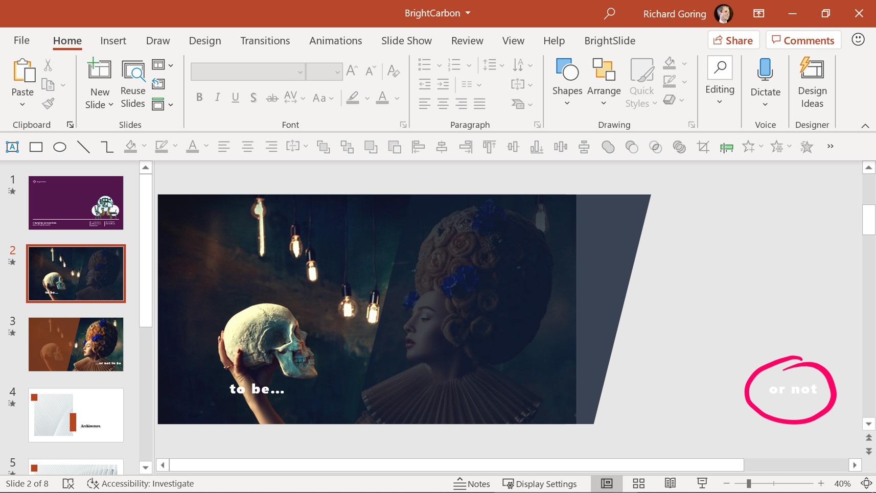
It’s not visible in show mode, but then appears to come in from the right as it moves from its off-slide position onto the slide. Having objects off-slide is a great way to bring them in, or take them out, using PowerPoint morph, and it’s really easy.
An expert-level tip: you also need to think about where the object is off-slide. It’s position off-slide will impact where it enters the slide, as objects move in a straight line from point-to-point during the morph transition. In this case we want the text to be lined up, so that it’s all just moving left-to-right and right-to-left.
Another consideration is distance. You may never have thought that your high school physics would be useful in presentations, but remember, speed = distance/time. The morph transition time is the same for all objects, so the distance it has to travel will determine the speed. As the ‘to be’ text is over on the far left of the slide and moves to the far right, you want to ensure that the ‘or not’ text off the slide has to travel the same distance, which is why it’s all the way over on the right, and not tucked away neatly just off the slide.
Here’s another example that uses off-slide content to bring elements into the slide and also take them out of it. As you go through the sequence you also realize that the slide uses visible elements in different layers to achieve an effect of revealing or hiding other content.

Going into edit mode you can see here the text, off-slide initially, on-slide next, and then off-slide again.
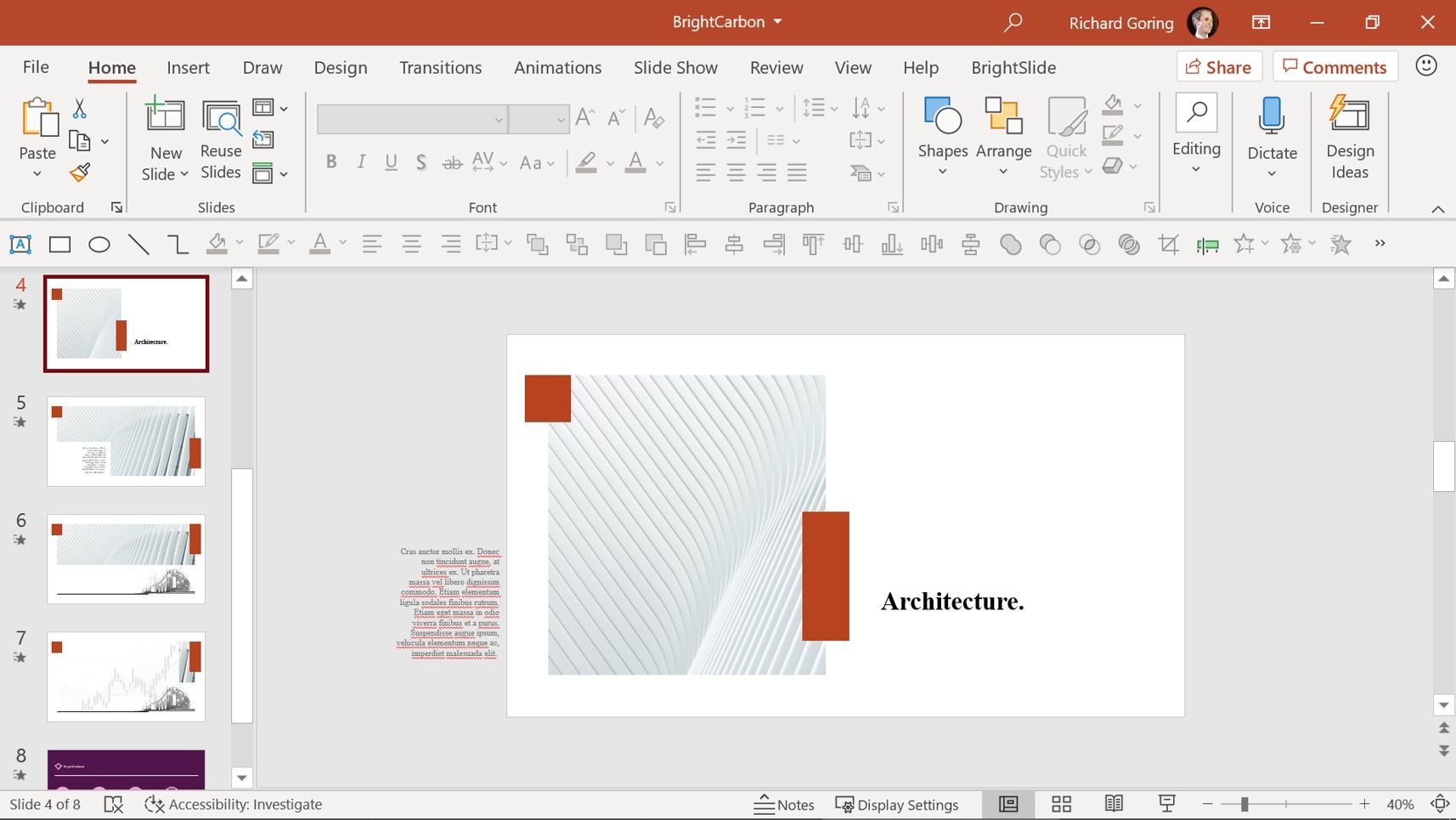
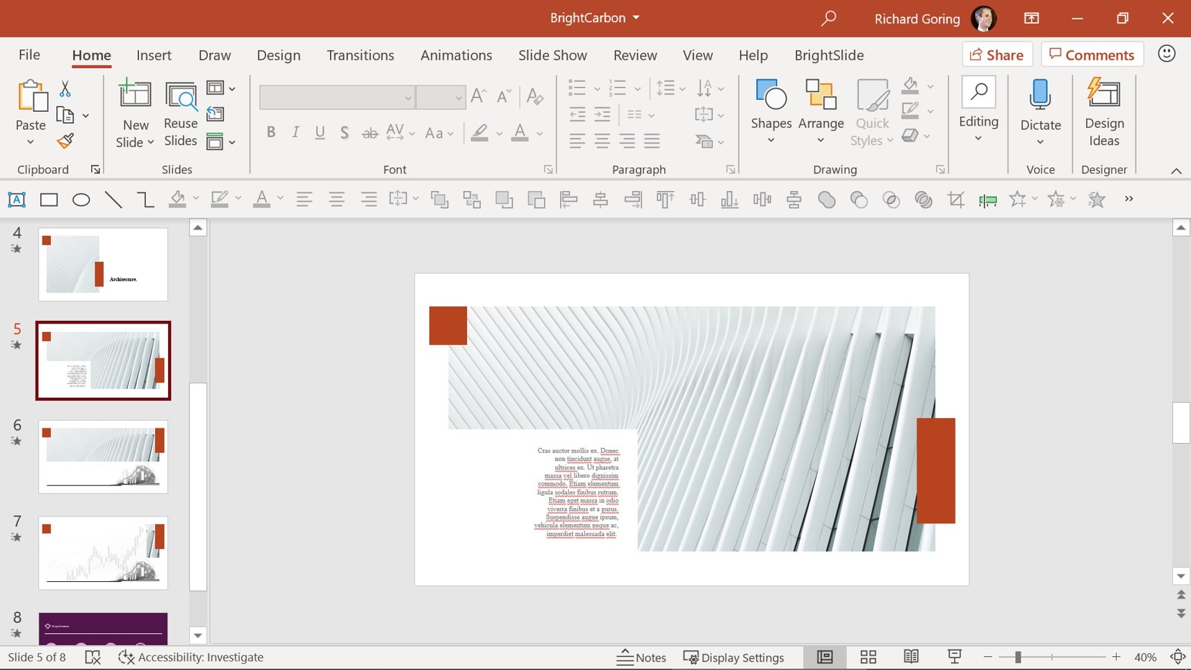
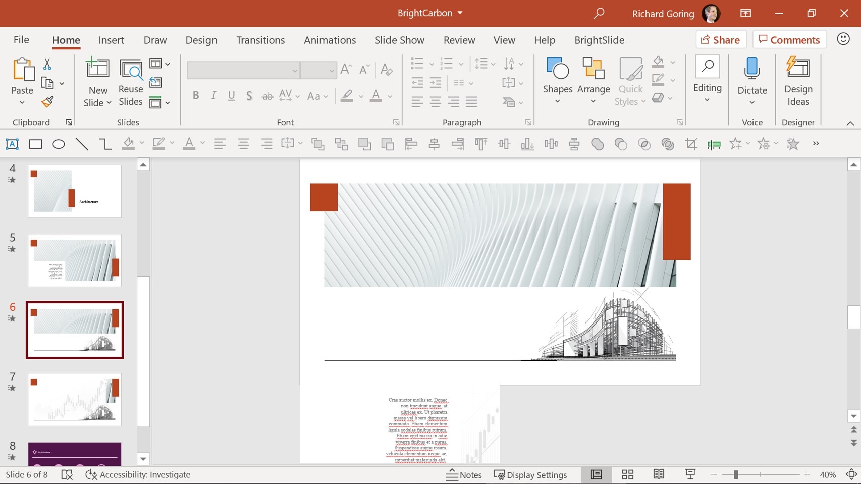
It’s aligned horizontally across the first pair of slides to achieve a horizontal motion, and then aligned vertically across the second pair to move the text down during the morph transition. The chart graphic is also off the slide – small and to the left on one slide and then larger and over on the right on the next, so that during the transition it moves upwards and to the right, and grows larger at the same time.
There are also elements used as masks with layered content to achieve reveal and hide effects. For example, there is a small white box on the left of the first slide, which expands on the second slide to be a placeholder for the text. Likewise, hidden away underneath the architectural photo on slide 2 is the building sketch, which moves down, out of its ‘shadow’ on the third slide, producing both a reveal and movement effect during the morph transition. By changing your perspectives, there are many different ways you can introduce content, all using PowerPoint morph.
PowerPoint morph can be a useful tool to highlight content in a much more interesting and dynamic way than usual. For example, here’s a set of three simple elements. By using morph, you can expand each element and bring in more detail. It’s achieved using a combination of techniques.

The text moves ever so slightly, partly because it makes everything feel a bit more dynamic, but also to emphasize the change that’s happening, so the text moves up or down, depending upon the position of the highlight image. The white outline boxes get larger, again all achieved with morph, simply by making the box larger on the second slide. In this instance, the red and blue boxes grow upwards, while the green box grows downwards, just for the look of it.
But the main change is that an image appears within the space created by the growing white boxes. If you look at the edit mode of the slides, these images are off-slide initially, and then move down into the correct positions on the second slide.
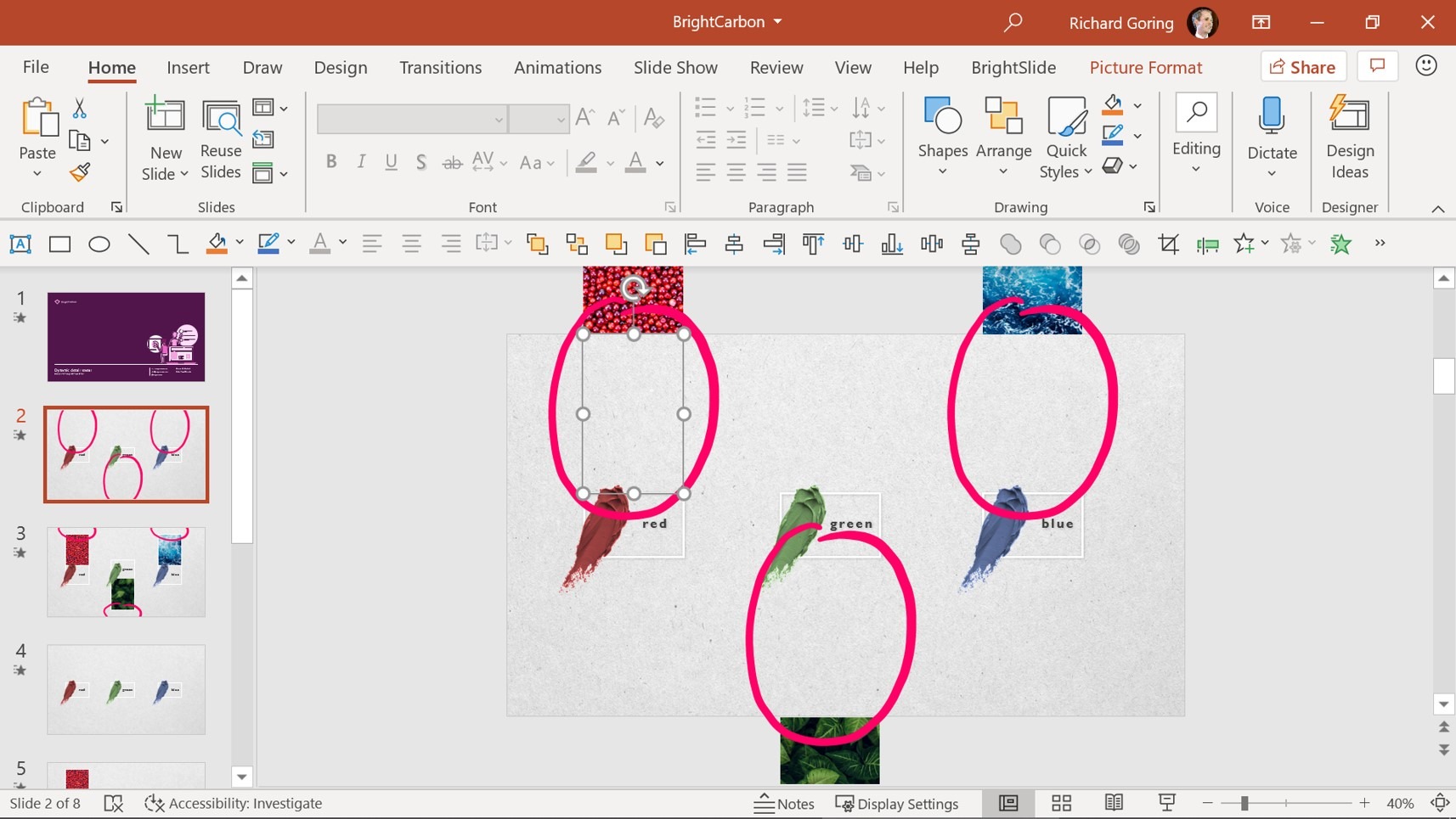
But you don’t see them moving from the edge of the slide as you would expect. Instead, they move under a masking layer – highlighted on the screenshots – using the background texture picture as a small mask just above or below the white outline box, which is then cropped down on the second slide.
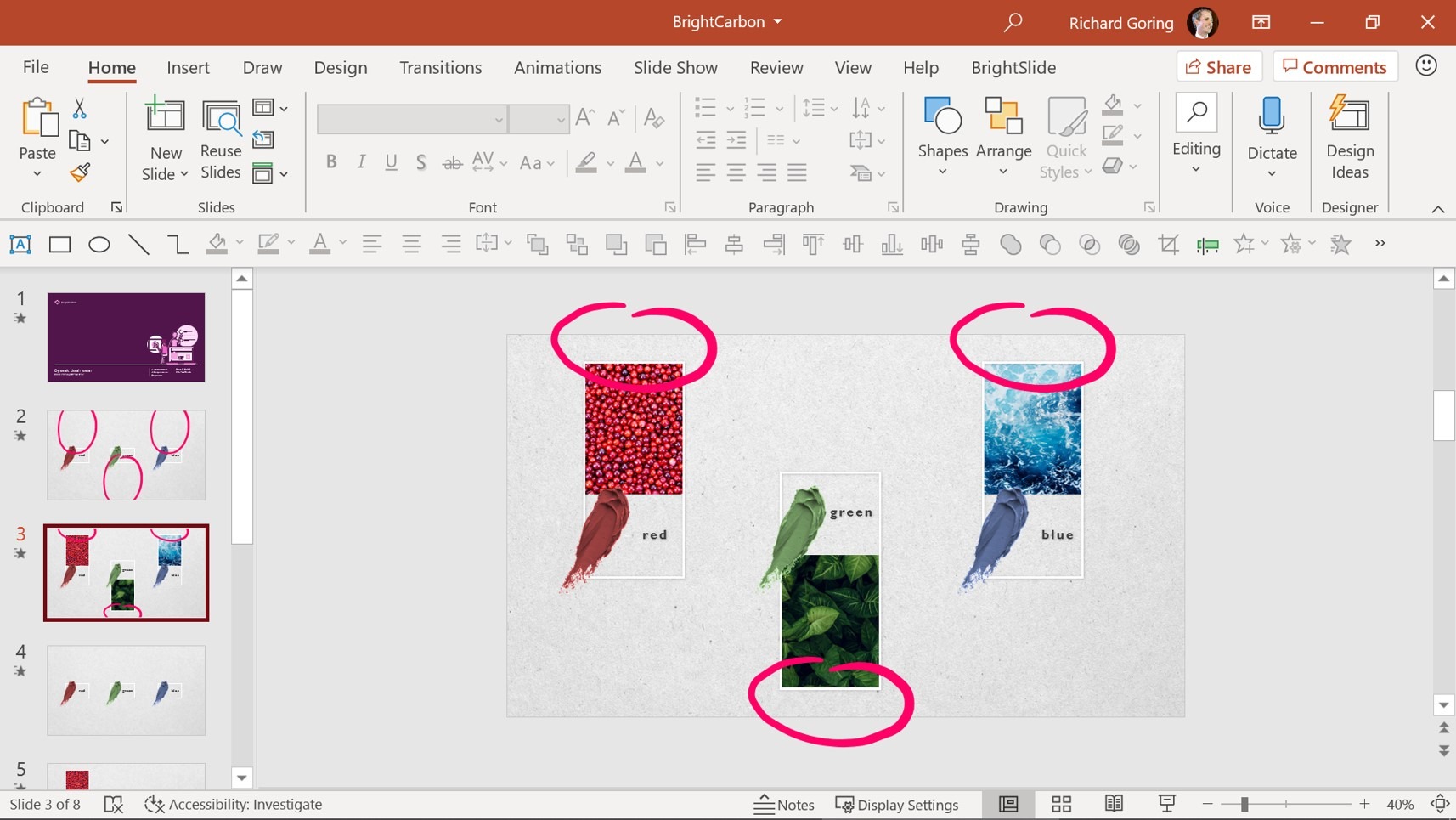
As the mask layer image gets smaller from the first slide to the second slide, the detail image moves from the edge of the slide to the middle, underneath the mask layer, creating a rather pleasing effect of the detail image coming into view.
That’s a nice way to achieve a detail reveal, but you could also split this effect up over several slides to focus on one element at a time, or, dare I say it, highlight elements in an agenda.
This time, the starting slide is the same, with all three elements in their overview state and no details showing. But on the second slide, only the red content changes, giving focus to that element and bringing in the detail image under the mask. On the third slide, the red elements revert back to the overview state, while the green detail elements are revealed, and then the same idea on the fourth slide to hide the green content and reveal the blue details.
Thinking about how to split content up over several slides can result in some lovely effects to move through content, either pacing the flow of information or focusing on what’s important in any particular area. The slide count in your presentation will balloon, but that really shouldn’t matter, as the time taken to present the information will be exactly the same – but you’ll likely get a much better response from your audience.
Using beautiful photos from Pexels or Unsplash, Morph brings some wonderful effects to photos, especially when tessellated or tiled. Here’s a lovely sequence of tiled photographs, which with morph can move around to reveal different parts of the image and a key message tile.

To create this effect, the images have been positioned in a tile arrangement on the first slide, and then moved and re-cropped on the second slide.
To understand precisely how it works, it may be worth a brief mention of how Crop works in PowerPoint. Typically, you’d think of the crop function, found on the Picture Format tab on the ribbon, over on the right-hand side, as a way to remove parts of an image, which it does. You can use the black grab handles to cut off the image. But as you do it, you’ll see that the rest of the image is still there, just greyed out and hidden from view.
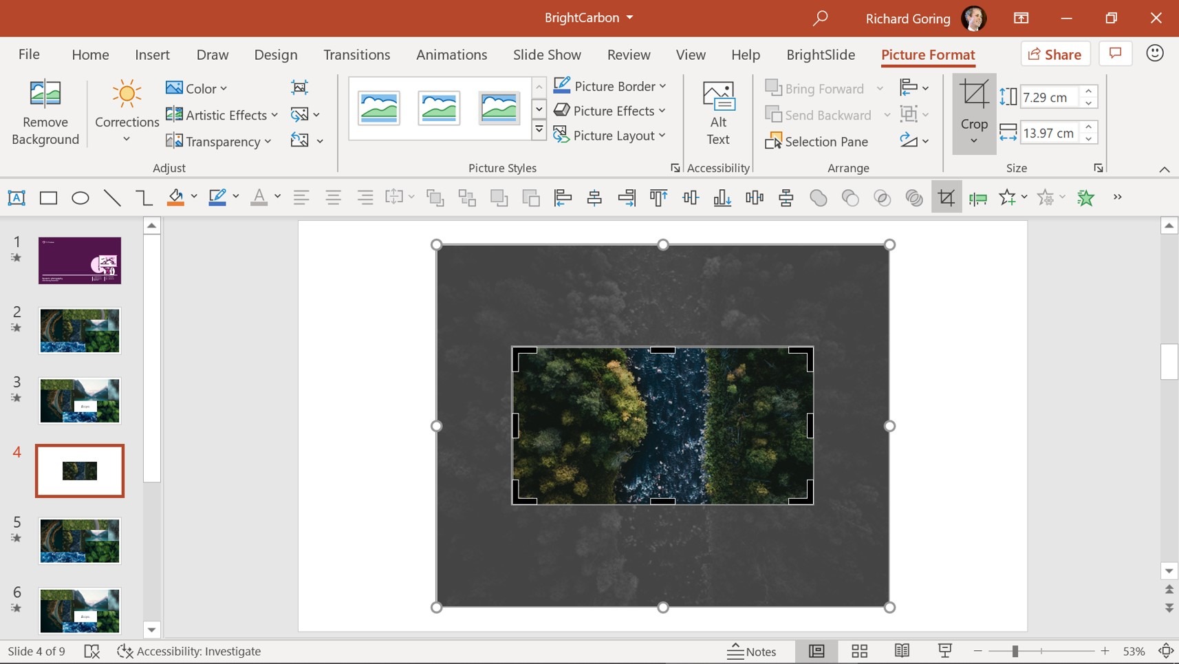
So it’s probably better to think of the crop tool as creating a window through which you can see the image underneath. That means that you’re using the black grab handles to change the size of the window. And it means you can use the white grab handles to change the size of the image, for example making it larger or smaller, or moving it around. The size of the window stays the same, but the level of detail or area of the underlying picture you see, changes.
You can choose how to crop the images to create different panning or zooming effects. Moving or resizing the image significantly in the crop window means the image will appear to move or zoom more quickly. Only a slight shift in position or size will result in a nice gentle movement. And moving the crop window, but not the underlying image will give the effect of tracking along the image.
Back to the tiled images example, the morph transition moves the image crop windows to their new position on the slide, but also changes the view through the window, which is why you get the effect of the images moving, but also changing focus, panning, and zooming, as we’ve altered both the position and size of the crop windows as well as the position and size of the underlying images.
For example, the waves image at the bottom has a fairly small crop window through to a much larger image. On the first slide, the crop window is focused on just the bottom left of the photo, and on the second slide the image is moved within the crop window just a small amount, so the window focuses slightly to the right and slightly higher up the image. It means a nice slow movement. Alternatively, if you change the position of the image in the crop window on the second slide, so that now it focuses up at the top, then during the morph transition, the image moves much more quickly, as it has to cover a greater distance in the same amount of time. Small tweaks like this can really change the result you get, so think carefully about them.
If you’re particularly eagle-eyed, you’ll notice that during the transition, there are gaps as the tiles move and shift. Each of the images in each of the sets of tiles is a full, standalone tile. There are no overlaps. That means when they all move, parts of the background are revealed before being covered again. To turn it up to 11 and avoid any gaps you have to think about how everything moves and layer the images so that there is always something covering every part of the slide, even during the movement.

In this second version of the same sequence, you can see that no gaps appear as the images move, which is achieved by expanding some of the images and carefully layering them so that as the visible parts of the images move, there is always an image underneath. This overlapping gets more complex, the more images you have, as you need to think about which images are going to cover or reveal others, but it results in an even more seamless effect that doesn’t look anything like your traditional PowerPoint presentation.
If juggling all those moving parts feels a bit too time-consuming, you can still achieve lovely effects with a static tile arrangement, and by simply changing the size or position of the images within the crop frame, you get a beautiful looking sequence. In this case, it all happens pretty quickly, and it’s a pleasing way to introduce a set of images.

As an alternative, you could go to the Transitions tab on the ribbon and over on the right, change the transition duration to something much longer, so that it’s a slow, steady, low-impact transition that adds a small amount of dynamism to a background, which might be useful for title slides at the start of a presentation or conference. With a combination of simple techniques you can certainly create quite a range of beautiful effects.
As morph is a transition between slides, sometimes you need an additional slide purely to achieve the effect you want during the transition. For example, this sequence is a slight zoom effect on the hallway image, which also darkens and photo text pans down through a patterned image.

It’s a two slide sequence, but it’s only the second slide that you want. And so to achieve the effect of everything moving and changing, you need to have a setup, or transition slide to start with, which then allows the morph transition to do its job.
Adding in extra slides to a presentation can be problematic as you don’t want to run the risk of the presenter getting lost or having to remember to click just to move to the next slide. Instead, if you need these transition slides, go to the Transitions tab on the ribbon and over on the right-hand side you’ll see options to Advance Slide. Typically you want a mouse click, giving you control. But in this instance, select the After box and choose 0 seconds. This means that when in slide show mode, PowerPoint will automatically and immediately transition to the next slide, giving you the effect that you want. It can be used for simple effects or more complex ones, but it’s always useful to think about. Just remind any users of the deck not to remove these slides. Although they’re not useful for content, as such, they’re vital to achieve the design or storytelling technique you want.
If you’ve enjoyed this blog post and you would like to advance your Morph game even further, check out our trilogy of tutorials. Oh, and if you’d like us to do any of this for you, we’d be delighted to.
Leave a commentWithout a proper PowerPoint template, presentations can be a bit of a mess. Here are the building blocks for developing a PowerPoint template that works!
By applying some key principles of presentation design, you can make your PowerPoint design really standout and deliver both a more ‘popping’, but also more effective presentation.
Most presentations are a cascade of text-heavy Death-by-PowerPoint slides. Online learners suffer the torture of brochures converted to click-through-eLearning. Most people now recognize that using visuals is the way to go. But how do you make visual presentations and eLearning that work? We think there are six steps you need to follow.
Join the BrightCarbon mailing list for monthly invites and resources
Tell me more!It provides us with powerful presentation material to use again and again. This helps us get our message across and enhances our professional image.
Joe Critchley Trade Extensions

Richard, thank you for your masterclass and for this detailed explanation follow up. For me, morph is the best feature of PowerPoint for many a year. I takes away the trial and error of animations, saving time. With a bit of thought it adds an elegance to transitions and your ‘imagination’ compels me to use mine! Now, if only Microsoft would ease the conversion to an HTML format and enable some way to track/report user input we’d have little need for the more expensive authoring platforms. Thanks again. Love your work and that of your team, and am astonished at the amount of expertise you share.
this was awesome!!! really helped with the features in depth that you taught in the master class. love bright carbon!
i took the masterclass and i know you said you put the background in the text. i cannot figure out how to make it crop and move. this is so cool. you guys are the best. can’t thank you enough.
The text effect is achieved by cropping a picture to look like text.
1. Add a picture.
2. Add text over the top of the picture.
3. Select the picture first, then shift-click to also select the text.
4. Go to Shape Format > Merge Shapes > Intersect, and the image will be cropped to look like text.
5. Copy the text image onto another slide (or click the thumbnails and use Ctrl + D).
6. On the second slide, select the text, go to Picture Format > Crop, and click on the image to move it within the text crop frame. (You can also move the text on the slide, if you want to).
7. Apply the Morph transition to the second slide.
This should now make the image move within the text (and also the text move on the slide, if you chose to move it). Hope that helps. We’ll do a full blog post with this technique at some point.
I’ve tried this now a thousand times and couldn’t get it to work. The key is that it can’t be a shape with text in it (even if that shape is see through and has no borders); it has to be a text box. Finally figured it out!
Thank you so much for sharing all these great techniques!
Question! When I start getting a lot of elements on a slide, the morph transition seems to slow down. For example, one that I’m working on currently has a 4-7 second delay from when I click to when the animation occurs. Any tips for overcoming this issue? Thanks!
That can be an issue with slides with very high resolution images. Using only PowerPoint objects, or low resolution (small file size) images, we’ve not seen any lag, even for slides with hundreds of elements on them. Do you know how large the images are? If they have a large file size and/or are high resolution that may be causing the lag.
I reduced the resolution and that fixed the issues! Thanks so much!
Thank you Bright Carbon! I’m really mind-blown by your masterclasses, both the content and very nice way of teaching. Will start using your BrightSlide soon, very excited for this! (I’m making first steps in presentation design freelancing, after a profession change) Video summary is also great, thanks
This is game-changing for me. As a “power user” of PowerPoint, I am stunned at how much I didn’t know before this tutorial. Thank you from the bottom of my heart!
I love these ideas, and think it’s so important to have more dynamic visuals when ALL of our interactions are now virtual. But, this brings me to my question. How do you get around the fact that motion transitions and animations are choppy over webex and zoom? If I choose the setting that maximizes my presentation for motion and video the text and images become fuzzy. So there doesn’t seem to be one setting that shows crisp visuals and still have smooth transitions. Since I can’t control the bandwidth on the viewers’ ends, I’ve resorted to not using any advanced animations or transitions, and presentations really suffer for it.
Thank you!
Awesome
Thank you!
I found BrightCarbon during my COVID lockdown last year and it has been a major silver lining as I have spent time going through the blog and videos and adapting my presentations. I had no idea PowerPoint could be so dynamic and current. BrightCarbon is my go to for all things presentation. I always get great value from each seminar. So GOOD!!!! THANKYOU!
great interactive presentation
Thank you..
i like the course becouse i already have photoshop background. thank you
Really, really, really like all these tips & tricks!
Superb as always!
Your tuition sessions are amazing and have helped me to create some excellent education presentations for children to learn and revise Science.
Thanks Richard and the BC team!
Russ K