• Comments: 4

Most presentations are a cascade of text-heavy Death-by-PowerPoint slides. Online learners suffer the torture of brochures converted to click-through-eLearning. Most people now recognize that using visuals is the way to go. But how do you make visual presentations and eLearning that work? We think there are six steps you need to follow.
  • Comments: 6

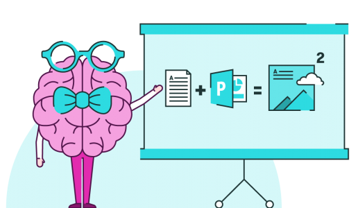
What's the difference between a presentation and a speech? Many people use the words interchangeably, but there are two main areas of difference. Speeches shouldn't be held up as examples of what those giving presentations should emulate.

Nov 2024
31st Mar 2016

Review: Visme

    Visual content – infographics, images and animations – can be a much more engaging way of presenting information than text. We at BrightCarbon believe in and share this kind of philosophy with Visme...

    Nov 2024

      Presentation Zen was published ten years ago. Al Gore won his Oscar for a film based on a presentation in 2006. Amazon sell more than 38,000 books with ‘presentation’ in the title, and more than 7,500 with ‘PowerPoint’. Which all sort or raises the question Why are so many presentations still crap? All those books, decks, all that advice – Is it even making a difference?

      Nov 2024
      • Comments: 1

      Unless you’ve been living under a rock for the past 5 years, you’ll likely have seen the use of colourful icons punctuating texts, tweets, emails, adverts. It seems these little pictures are becoming a weighty force in how we communicate. What does this mean for language? And most importantly, what does it have to do with PowerPoint presentations?!

      Nov 2024
      • Comments: 1

      We live in a noisy world. Advertisers constantly clamour for our attention and we’re much less likely to engage with something if we have to actively seek it out. The trend is that content is becoming bitesize. So how can we create content that will keep audiences engaged? Here are ten tips.

      Nov 2024
      • Comments: 2

      When designing presentations it can be easy to get swallowed up by the desire to exercise that design trick you’ve been dying to use, or to use white space in a quirky designer-y way; it is, after all, part of the nature of a designer to create interesting, beautiful things. What can be tricky, however, is to keep in mind how a person might absorb the information onscreen...

      Nov 2024
      • Comments: 1

      Presentation handouts and leave-behinds are a great resource in giving your audience a tangible reminder of you and the company you represent. The problem is that they're oft-neglected and oft-ignored. So how do we create handouts that not only accurately represent our content, but look great and don't take a fortnight to create?

      Nov 2024
      • Comments: 3

      For consultants, the client presentation is part of the value delivered – and so it makes sense to get it right. It’s pretty silly to spend weeks researching, thinking, testing, and prototyping – only to make your work look bad with terrible slides and a confusing talk. We share 9 presentation tips for consultants.

      Join the BrightCarbon mailing list for monthly invites and resources

      Tell me more!